

Background
Visualizing the future, translating bold ideas, working through an iterative design process, and collaborating with others are activities we strive to engage in at Q Collective. This project met those goals and challenged us to use design to share the stories of two cities who are ready for the future.
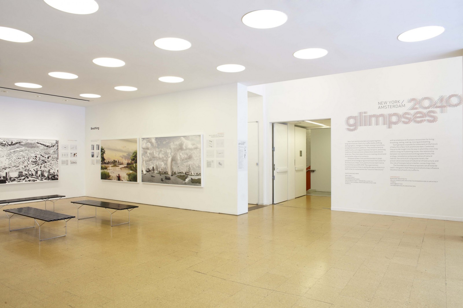
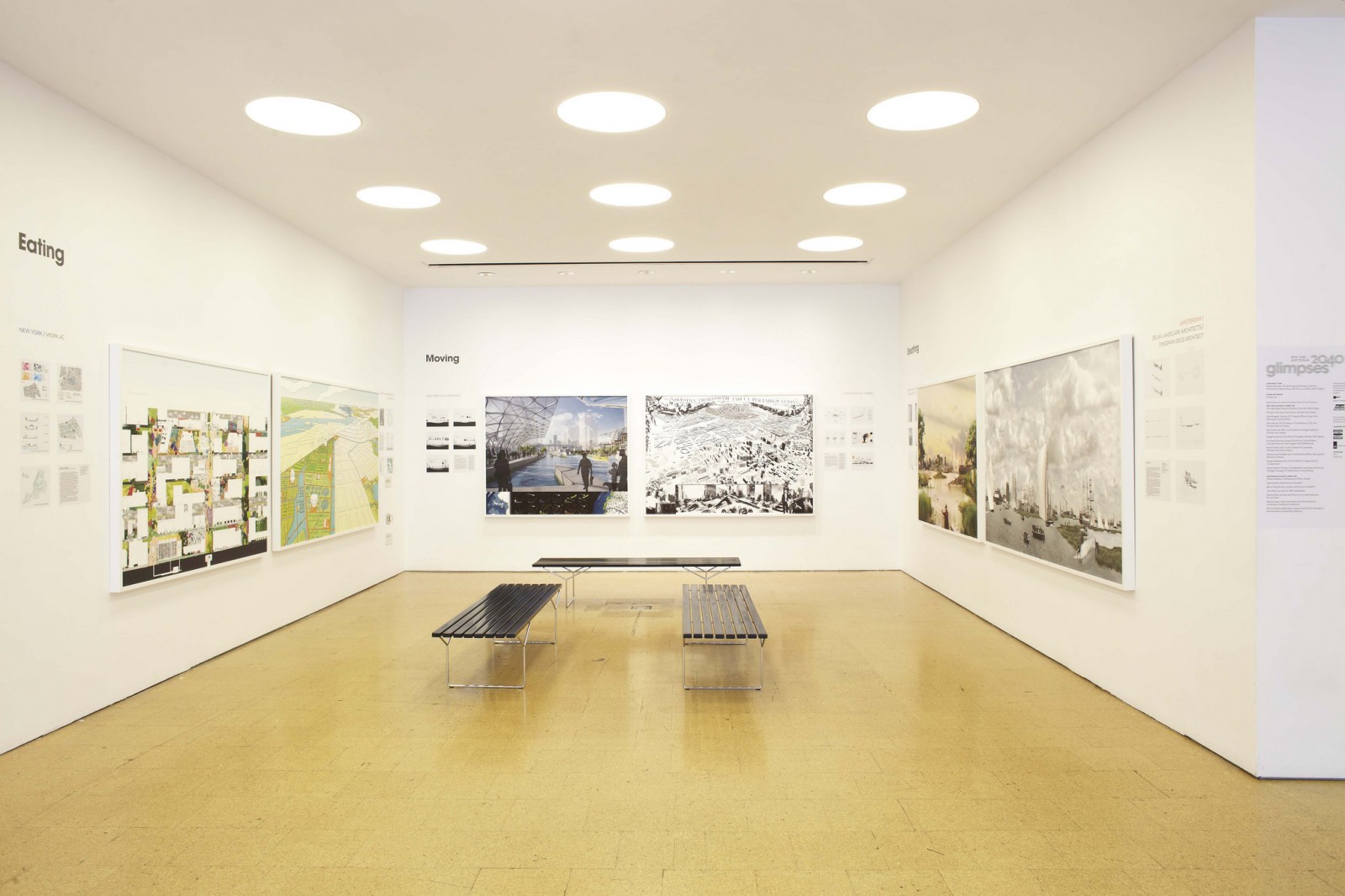
Glimpses 2040: New York and Amsterdam was a concurrent exhibition in two locations and featured the work of ten architecture and urban planning studios who envisioned what life might be like in 2040. American and Dutch studios were paired, and visualized one of the following 5 activities as they related to the future of cities located by large bodies of water: breathing, dwelling, eating, making and moving. Q Collective was asked to create the Glimpses exhibition identity and signage, design an exhibition framework for the varied work of ten architecture studios, and design the gallery guide and family guide.

Typemark, Identity and Process
We started by asking, what is a glimpse? We peeked through blinds and fences, looked around, underneath and between objects, and tried to catch things in motion. We made sketches to explore how letters and images become distorted, fragmented or blurry when obscured or in motion. And we made patterns, textures and shapes to create environments for the typography to interact with.

Visual ideas for the identity sprang from thinking metaphorically: port holes, curtains, light coming through closed door, frames of all kinds (picture, window, eye glasses), a streetlight on a foggy night, et cetera.
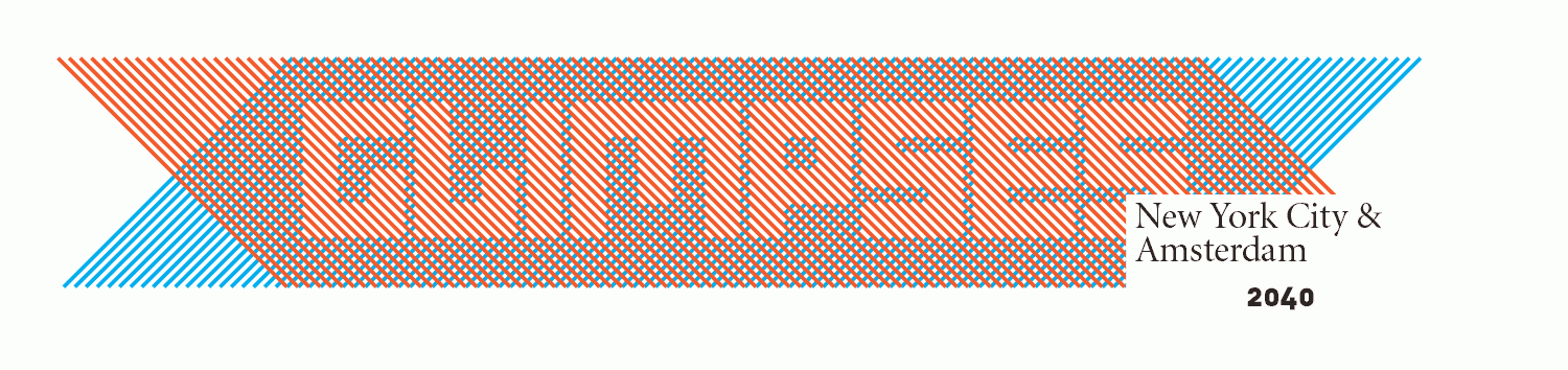


The final type mark is built with a series of colored, angled lines, staggered to reveal the exhibition title. This solution communicates motion and temporality while anchoring the mark with a bold, modern typeface.

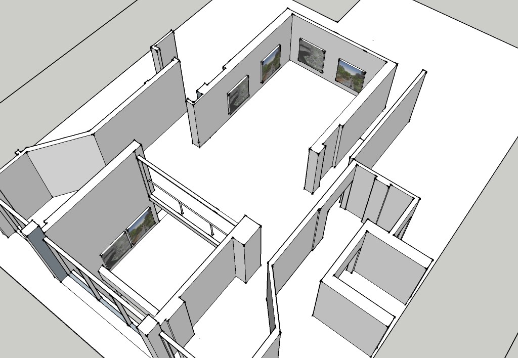
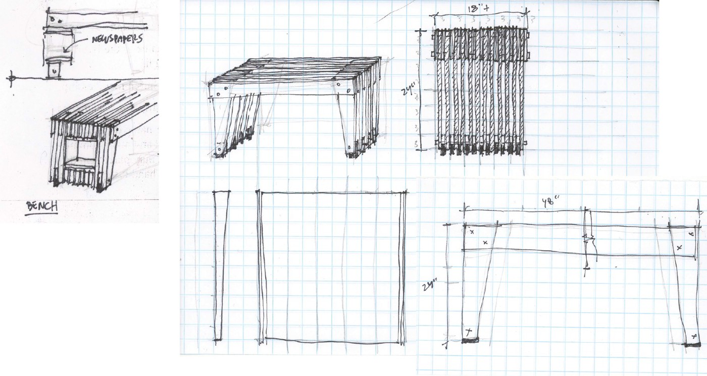
During early stages of design development, Google Sketchup was used to physically understand the space and how people move through it. At the same time we were experimenting with how materials and patterns could be used for furniture or wall graphics to further express some of the visual ideas of color, repetition and negative space in the typemark and identity.

Exhibition Design
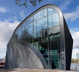
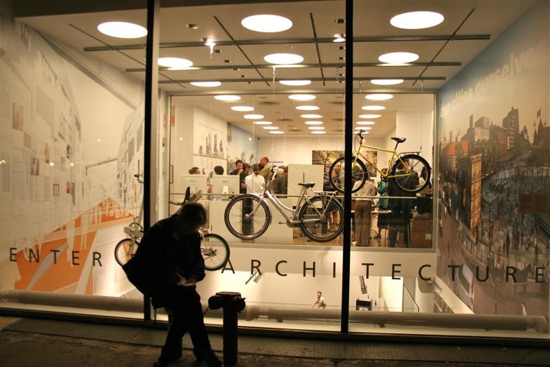
The exhibition was hung concurrently in New York at the Center for Architecture and in Amsterdam at ARCAM. Designing the title and exhibition walls was especially challenging because the two galleries have very different floor plans and wall structures. ARCAM has one large glass wall and curved interior walls, making it impossible to hang large 2-dimensional work. The Center for Architecture has galleries on two levels with an atrium adjacent to windows on the street.


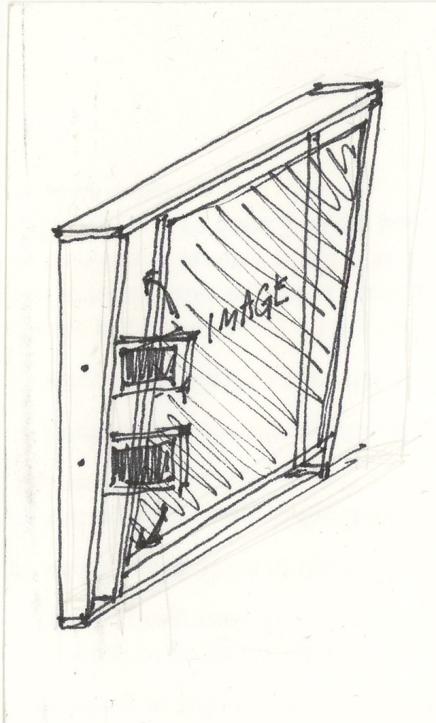
Additionally, establishing a visual dialog between the work by the Dutch firms and the work by the New York firms left little flexibility in how the exhibit could be laid out. The large images for breathing, for example, needed to be shown side by side, or in close proximity. Each exhibition space included a title wall, two large-scale wall maps, ten framed images with six supporting images / maps and a reading area.
At the Center for Architecture in New York, framed images were wall hung with supporting images and maps affixed to the wall beside them.

At ARCAM in Amsterdam, framed images and panels containing supporting images and maps hung from cables anchored to a flexible track ceiling system, giving the illusion of floating screens in this dynamic space.


Gallery Guides
As part of a Gallery Guide, each studio was asked to write about the future of city life, providing necessary context for their visionary ideas as well as firm profiles. The guide was designed as a newspaper, a significant object in city life seen on benches, subways and at corner kiosks. Newspapers provide a glimpse of what happens daily.
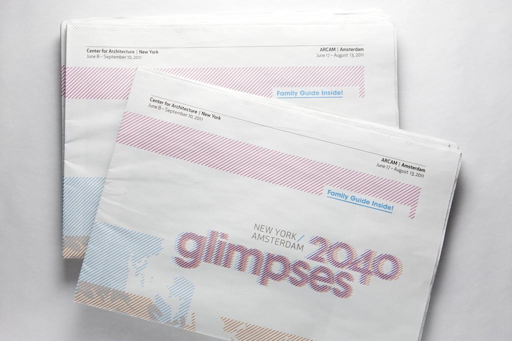
A newspaper Family Guide was designed to help young visitors interpret the exhibition in both English and Dutch.
