Challenges
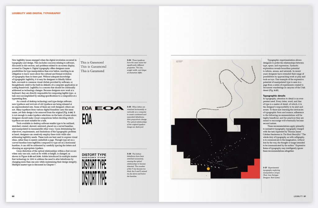
First published in 1985, Typographic Design: Form and Communication was designed with a bold grid and typographic system that has endured for five editions. Three typefaces, three sizes and five horizontal columns yielded a versatility that is surprising for its simplicity. The book is immediately recognizable among the vast selection of books on typography. This familiarity, it turns out, was the biggest challenge we faced when considering if a new design was necessary for the 6th Edition.
With the addition of a new chapter and expanded content, but no allowance for additional pages, a refreshed design was inevitable. This visual update, however, needed to be an homage to the critical typographic details and structure of previous editions.
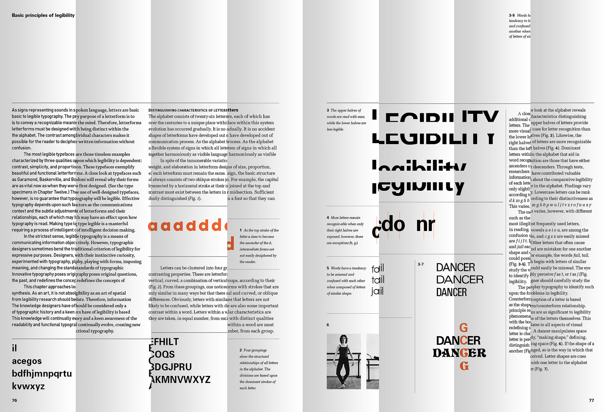
5th Edition
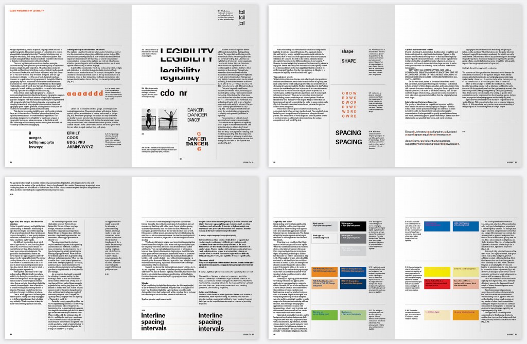
6th Edition
Design Analysis
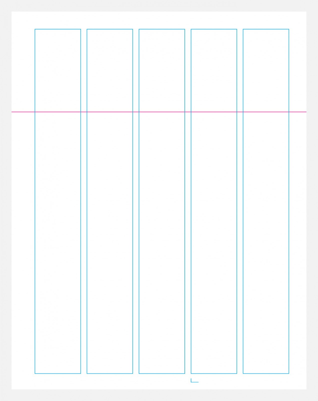
Univers 55 is set 9/11 for body text and 7/11 for captions. Univers 75 is set 9/11 for headings. A 5-column layout uses four columns for type or image, and a fifth for caption or white space. A single flow line approximately 25% from the top of the page guides movement and preserves hierarchy.
Incredibly, that is the entire style guide for all previous editions. We are continually impressed by how this minimal typographic system effortlessly presents a wide array of illustrations, charts, images and type samples. The visual information, timelines, text, assignments, case studies and specimens all remain distinct and formally recognizable instead of appearing forced into a banal system.
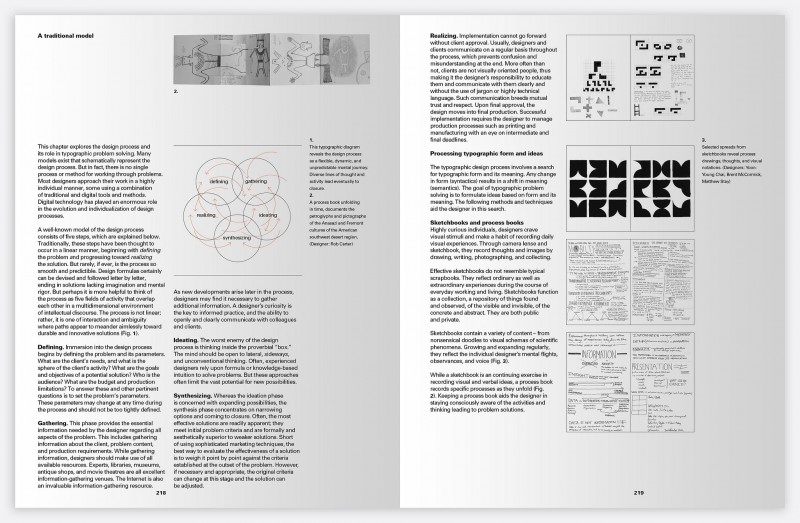
5th Edition
Refreshed Design
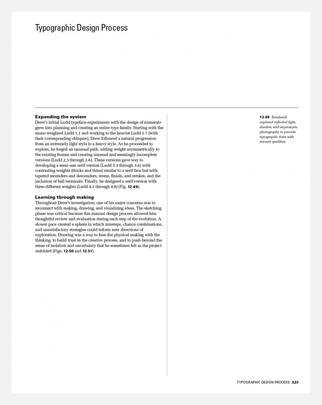
By subtly adjusting the proportions of the grid and margins in the new 6th Edition, as well as preserving white space at the top of each page via a flow line, our intent is a resemblance to previous editions.
To accommodate a new chapter without adding more pages to the book, we reduced the outer and top margins as well as added a sixth column. This yields more live area for content per page, but also more flexibility in layout.
6th Edition
Meet Melior…
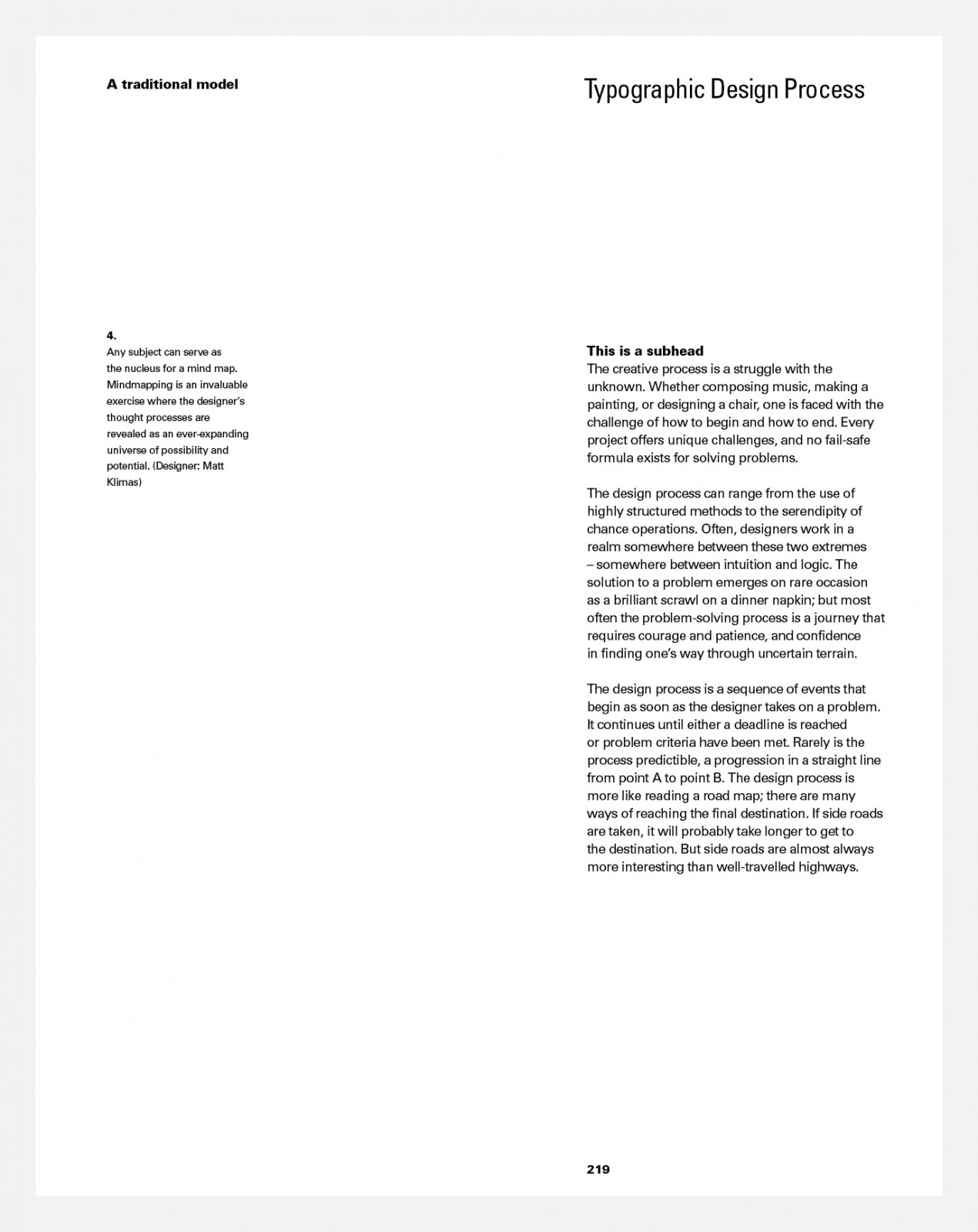
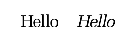
While Univers remains a foundation of the refreshed design, we hunted for another type family that would be a proper complement. Melior, designed by Hermann Zapf, has letterforms that are subtly rectangular in shape with barely bracketed flat serifs. It was originally designed as a newspaper text face that allowed for a greater density of letterforms per page while preserving legibility, and appearing light in type color. A noticeable but minimal stroke variation enhances the contrast between body text set in Melior, and headings, subheads and figure numbers set in Univers 75.
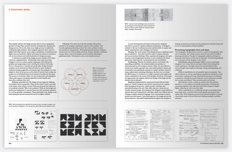
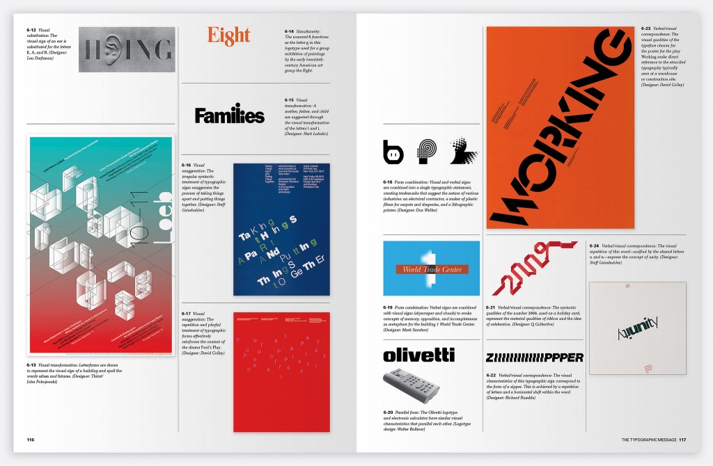
Using horizontal and vertical rules, we expose the grid and form skeletons to hold text and images. This accentuated structure demonstrates both the rigidity and flexibility of the grid to students reading the book.
5th Edition
6th Edition
An important goal of the refreshed design is to present a greater visual distinction between headings, body text, captions and figures. Grouping images on the inside of pages allows for more predictable white space and further articulates the difference between text and image. This also helps construct a stronger connection between the text and the referenced figures.
We chose to emphasize specific illustrations, as well as establish page-to-page rhythm by violating the flow line selectively.
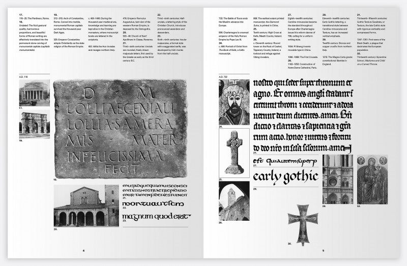
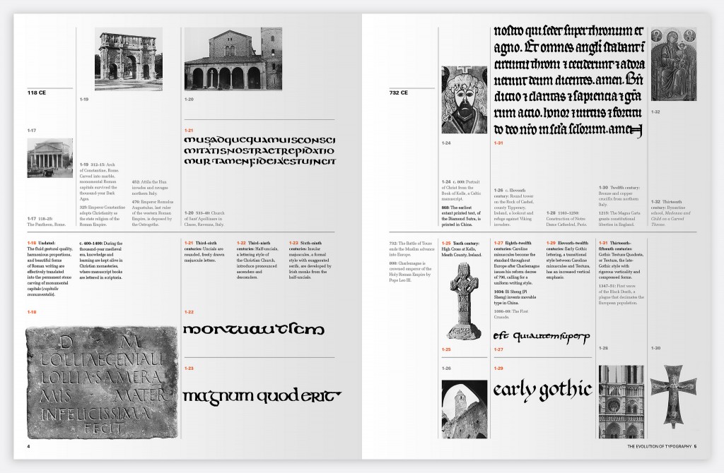
The final, most difficult design challenge was adapting the typographic timeline in Chapter 1 to the updated typographic system.
5th Edition
Visually the layout is an abstraction of traditional timelines. A horizontal line across the middle of each page combines with clusters of text above and below. Vertical lines extend up and down from each moment in time to the related image.
To make the information simpler for the reader to scan, cultural events are placed above the line while typographic events are below. To further emphasize this distinction, text for cultural entries is light gray in color.
6th Edition
