Challenges
First published in 1985, Typographic Design: Form and Communication was designed with a bold grid and typographic system that has endured for five editions. Three typefaces, three sizes and five horizontal columns yielded a versatility that is surprising for its simplicity. The book is also immediately recognizable among the vast selection of books on typography.
The cover expanded on the typographic palette. Abstractions of a capital T and D were playfully permutated from edition to edition further anchoring the visual system.
As new authors, we chose to expand on the legacy of the cover series to connect to the past and to ease the transition to a complete interior redesign.
Option 1
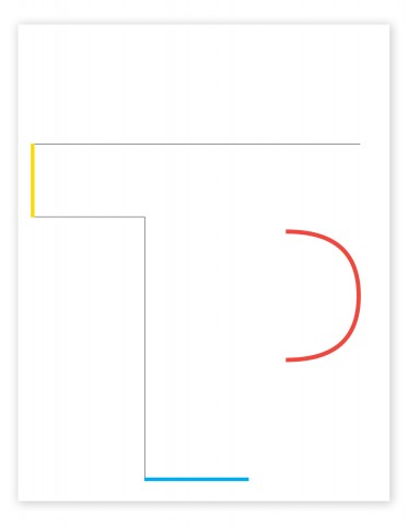
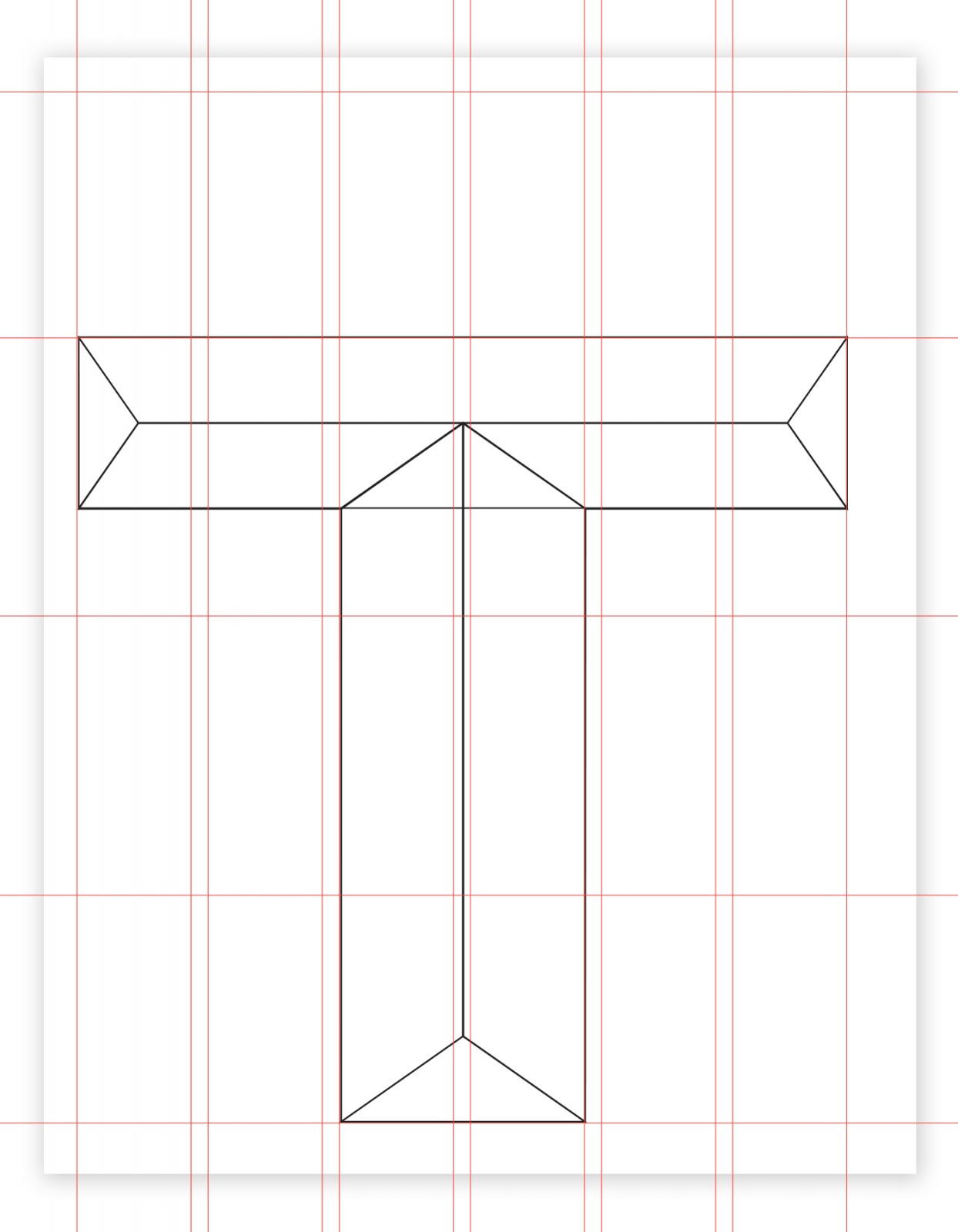
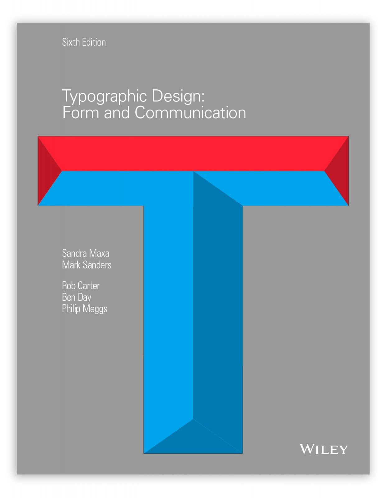
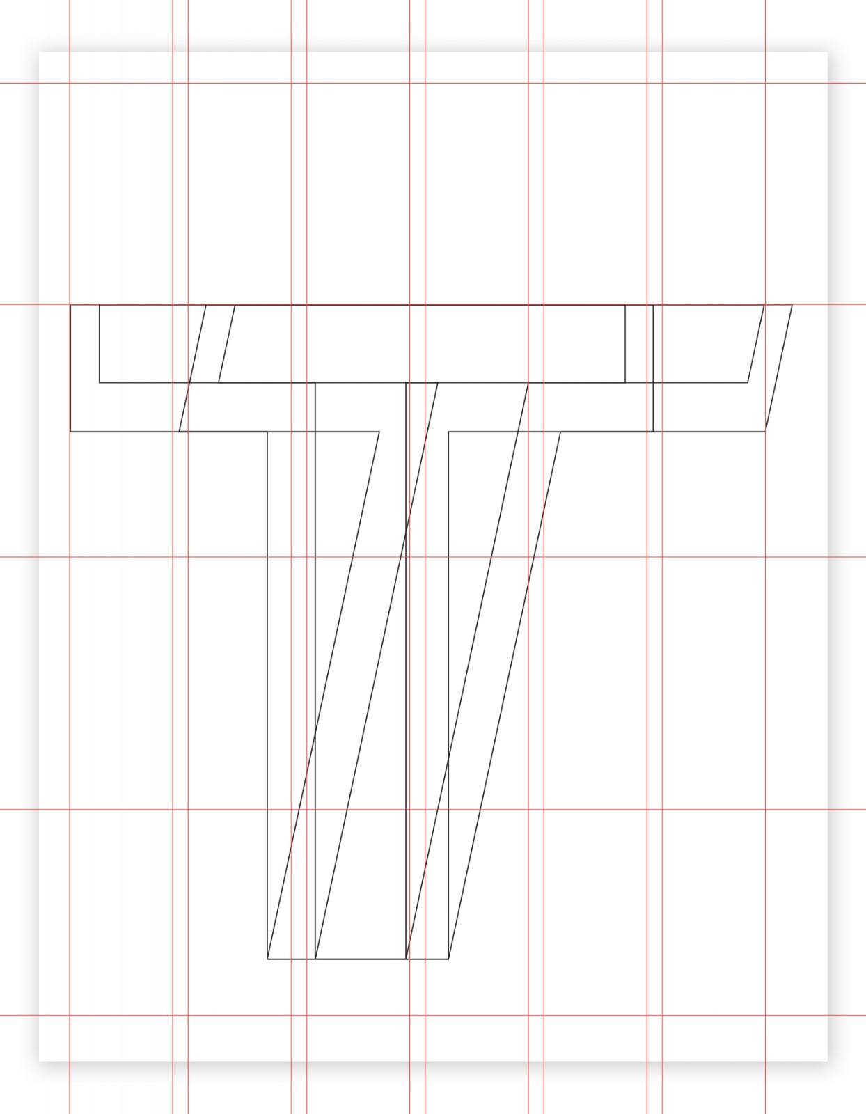
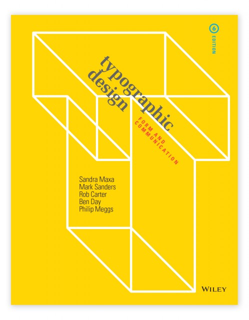
The capital T was redrawn to conform to the new six-column interior layout as well as reinforce the primary horizontal flow line. The letterform was then partially shaded to simulate visual depth. Various experiments examined the minimum number of parts that would communicate the letter T while promoting fluid movement through the grid.
Option 2
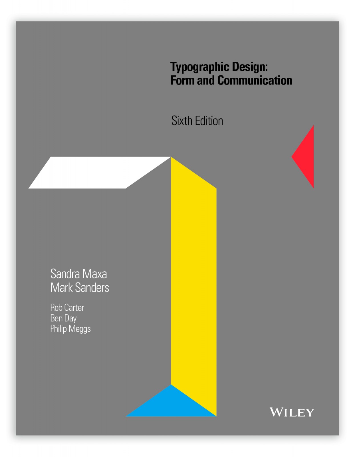
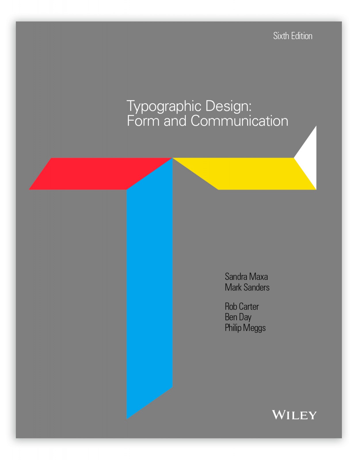
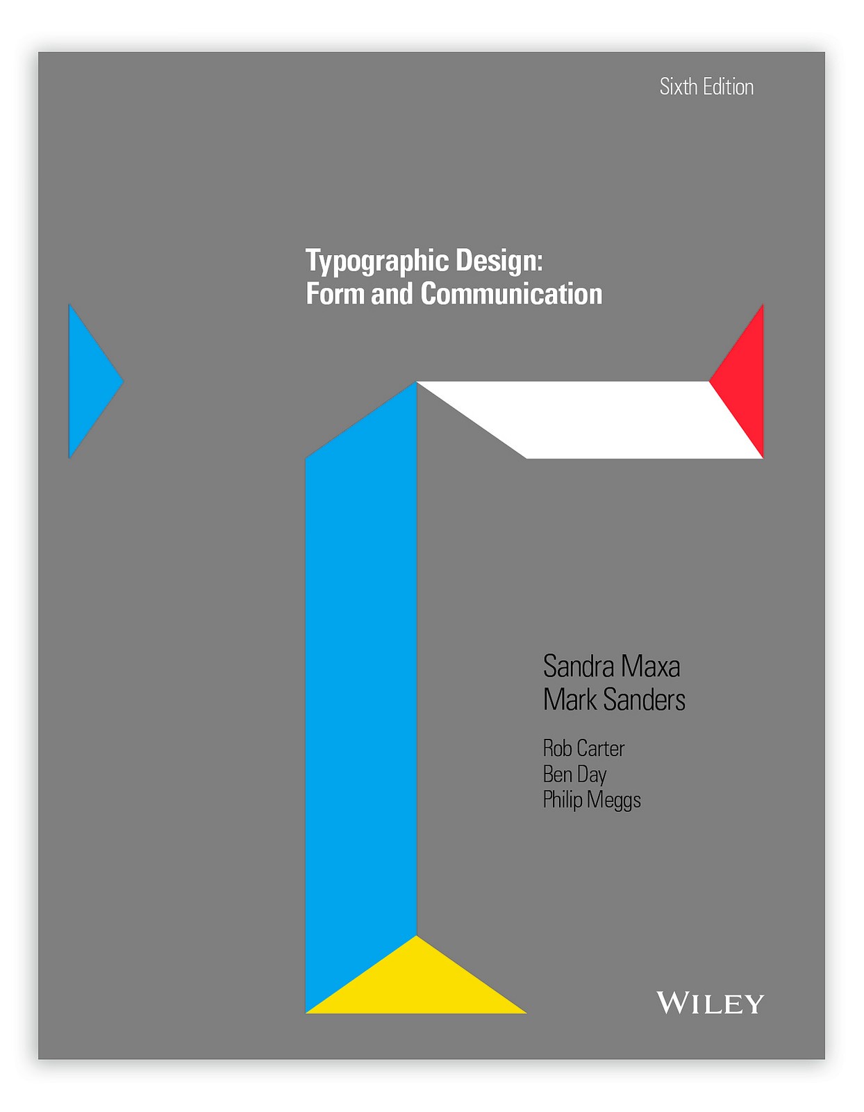
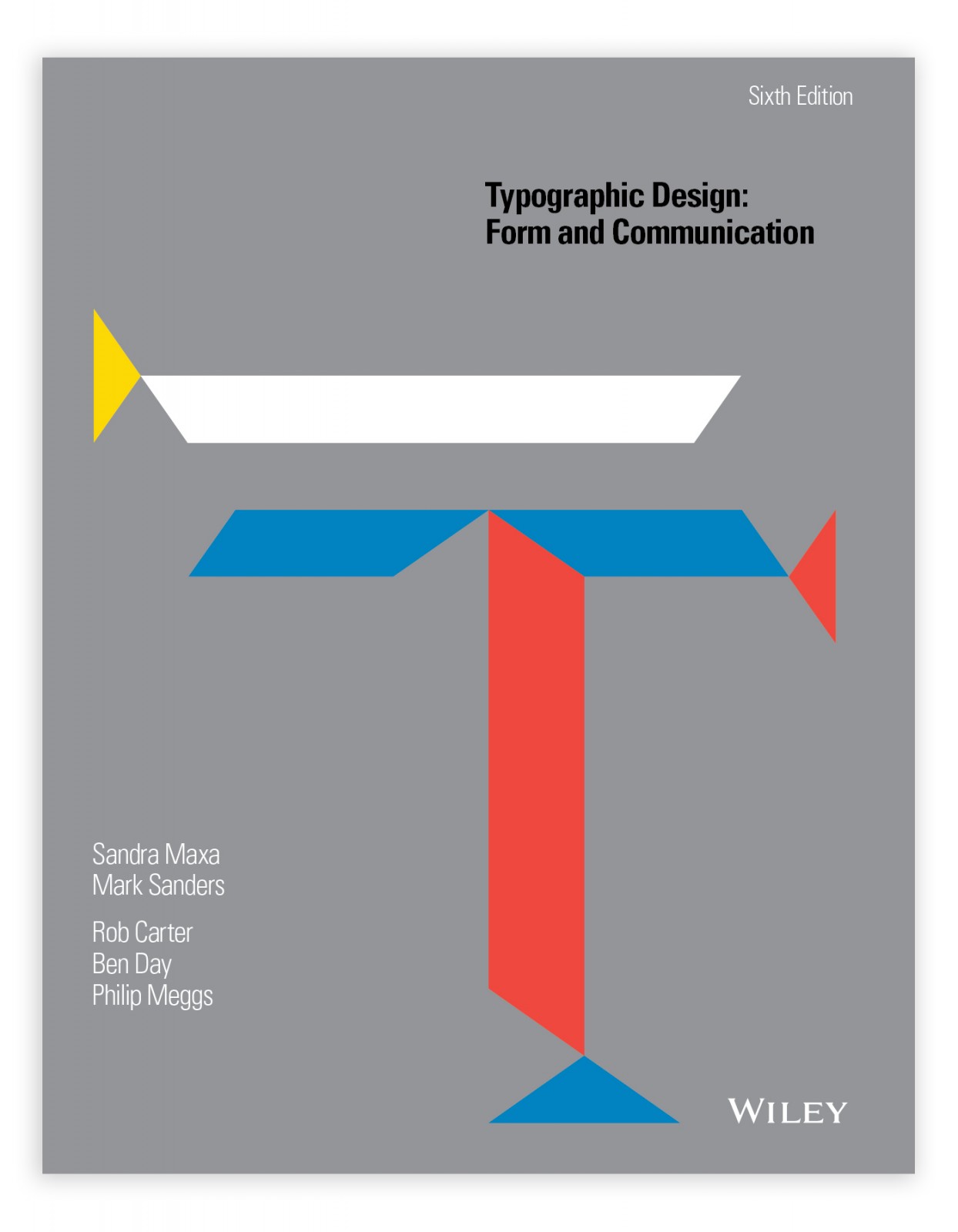
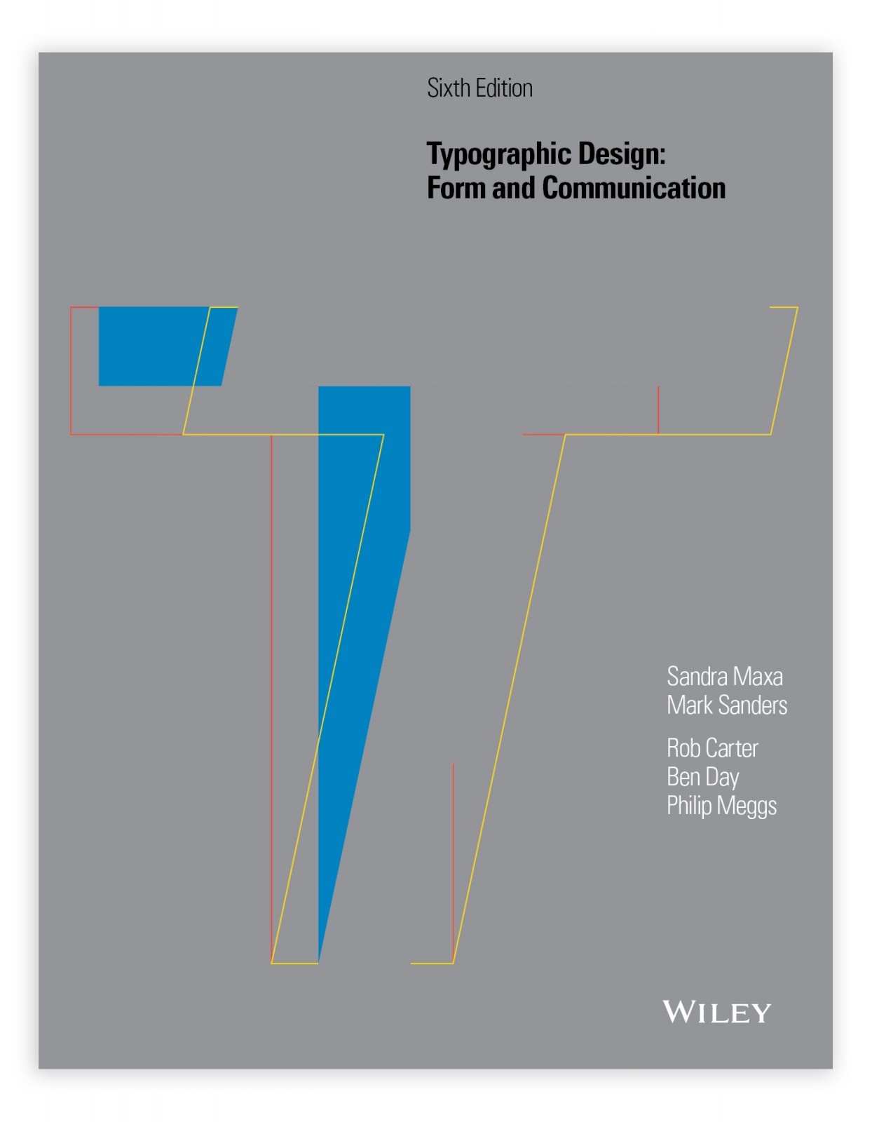
Using the same grid-based reconstruction of the letter T as Option 1, the facets were slid outward to further promote visual movement.
Option 3
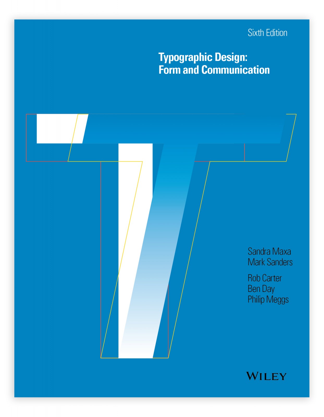
Two weights and two orientations of a Univers letter T overlay the grid as well as each other. Variations in outline, shading, and color produce movement and depth accomplished by very few parts.
New Directions
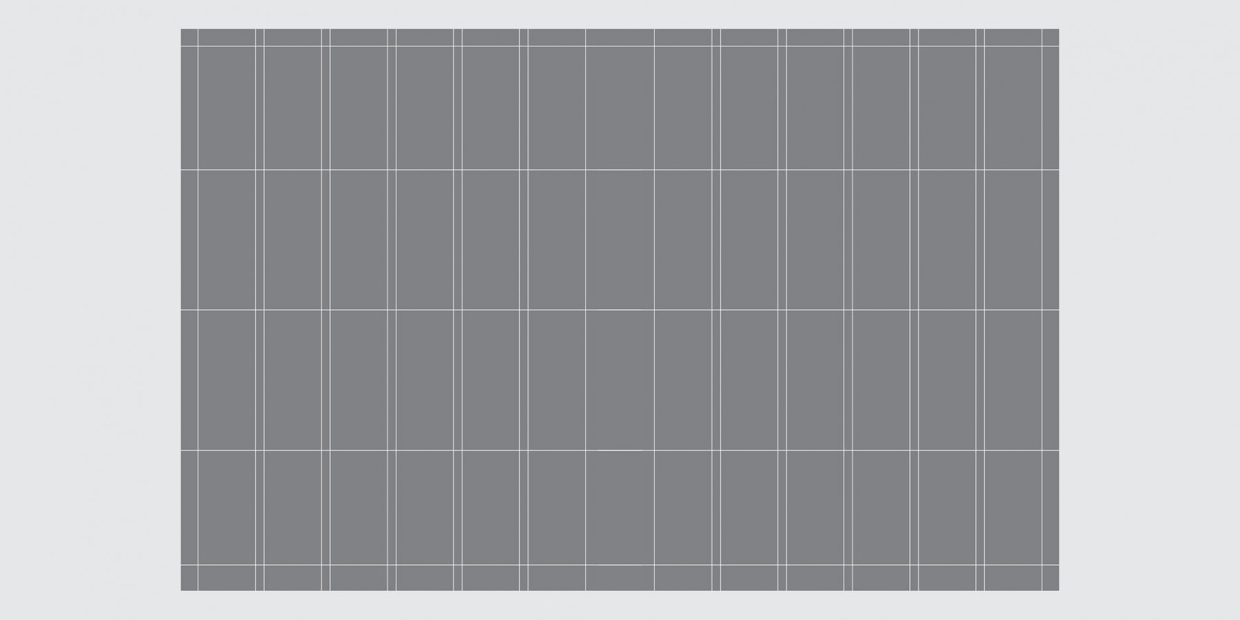
The new interior design highlights the structure, movement and versatility of grid. We wanted to see if the cover could embody this system, too, while demonstrating new ways of visualizing a grid. This also allowed us to playfully constrict hierarchy and typographic motion with the new palette of typefaces.
Option 4
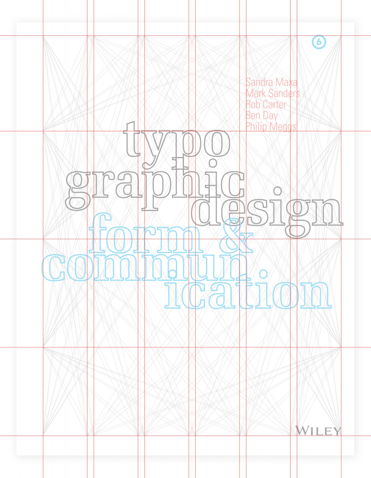
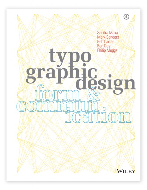
Inspired by wall drawings by Sol Lewitt, this option presents form by highlighting connections.
Option 5
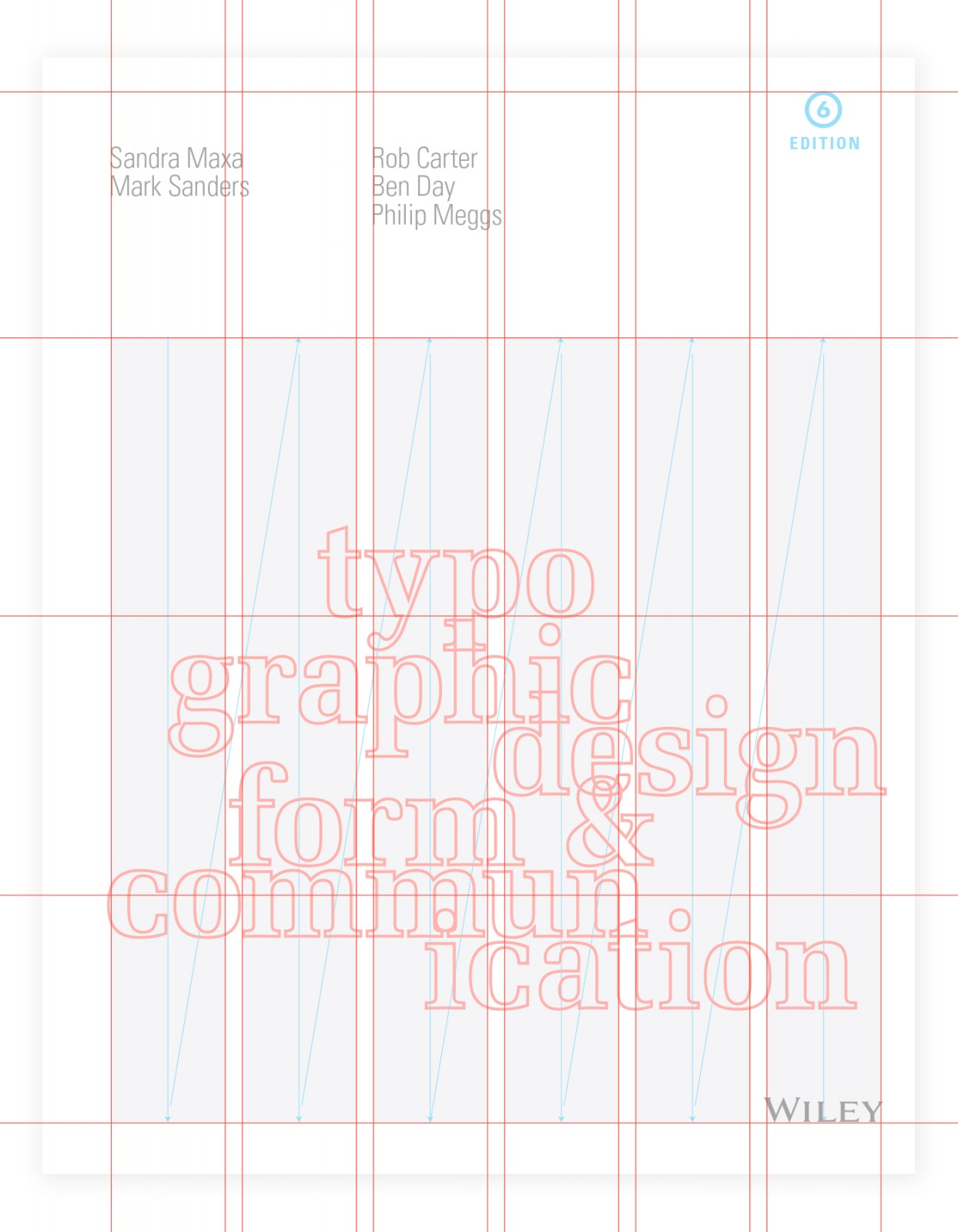
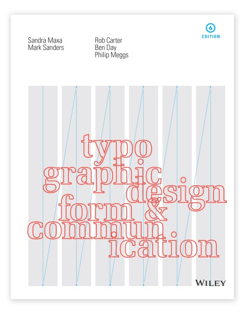
Rigid columns and arrows demonstrating eye movement form a solid structure for secondary type, while the lines of type for the title shift back and forth.
Option 6
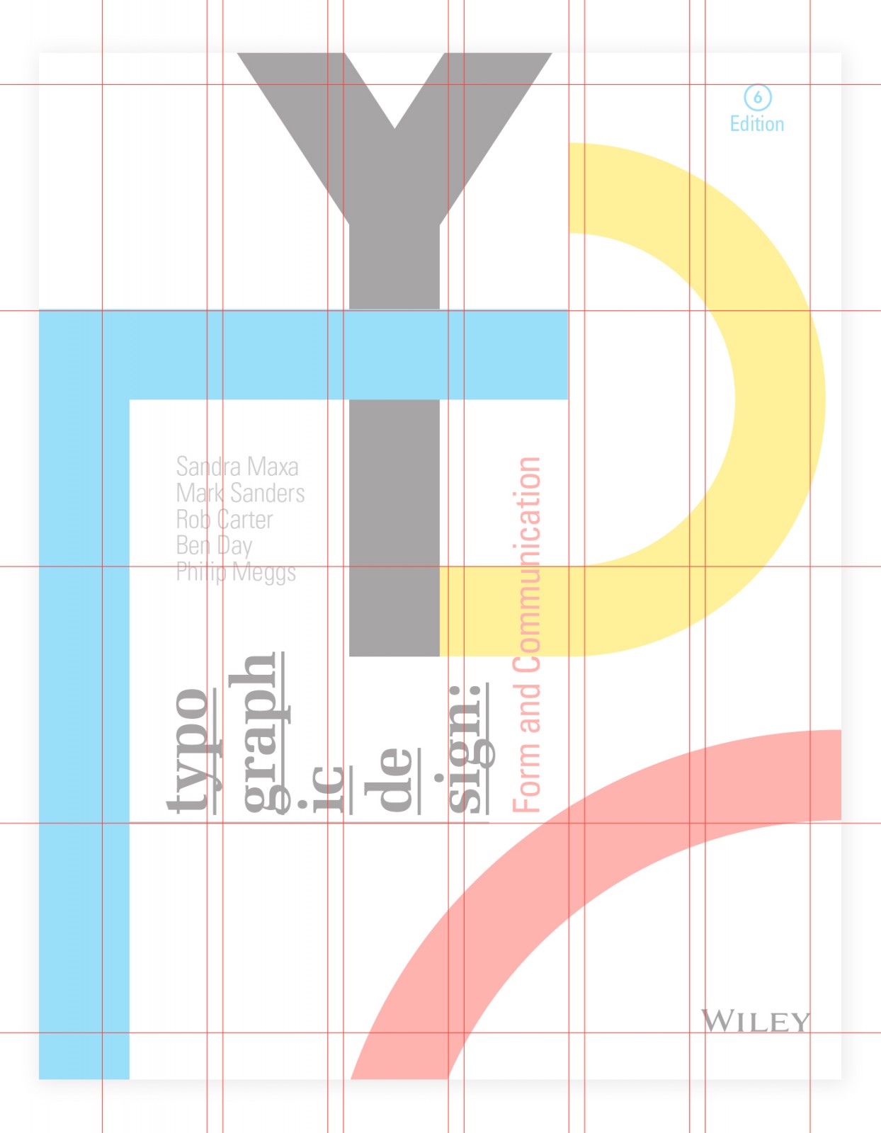
Abstract shapes suggest letterforms, while creating dynamic form and counter form. Text inhabits some of the negative space as well as rotates with irregular rag to complement the grid and geometric structure.
Option 7
Lines build the illusion of depth, but also form a literal frame for type to engage the composition in several directions.
Option 8
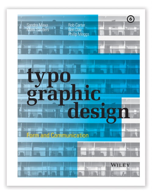
A repeated photograph presents the perceived monotony of grid, while an overlay of colored blocks introduce an order to the composition.
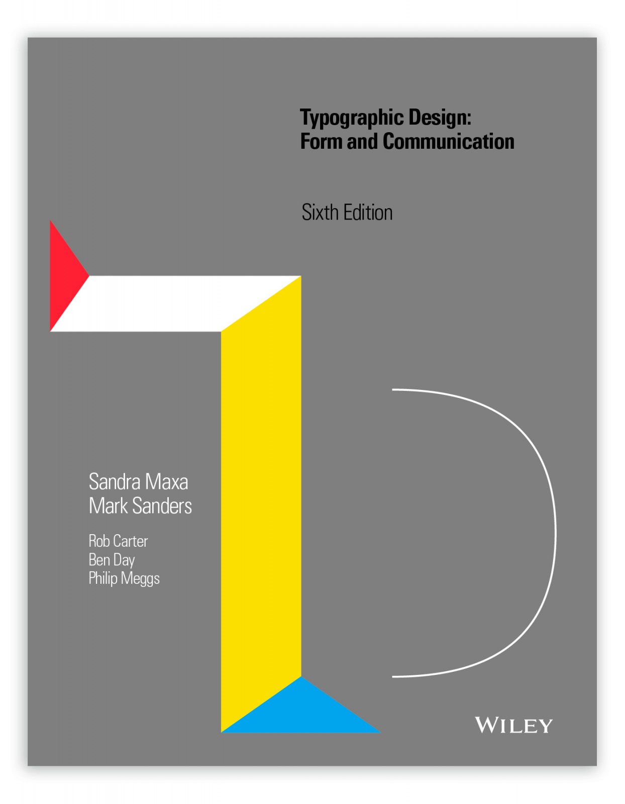
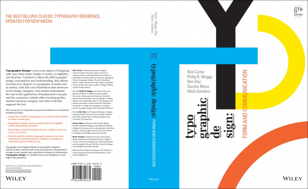
Final Cover
The capital T is an important symbolic highlight of the covers in past editions. While other design options were either slight or total deviations from this, we wanted the T to remain as the foreground element. By only showing half of the letterform on the front cover, we wrapped the rest around the spine and onto the back cover. This builds a structure from the grid system that continues the spirit of the series while defining a new path which is intrinsically connected to the new design.

