Background
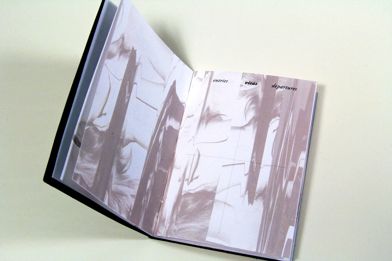
Italo Calvino’s 1972 novel, Invisible Cities is written as conversations between Marco Polo and Kublai Khan describing 55 cities as physical spaces but also as impressions of residents and memories of visitors. With poetic prose, Calvino presents an alternative to how we usually think about cities, using metaphors based on human nature, linguistics and semiology. Typographic play and manipulation are springboards for visually investigating these metaphors.
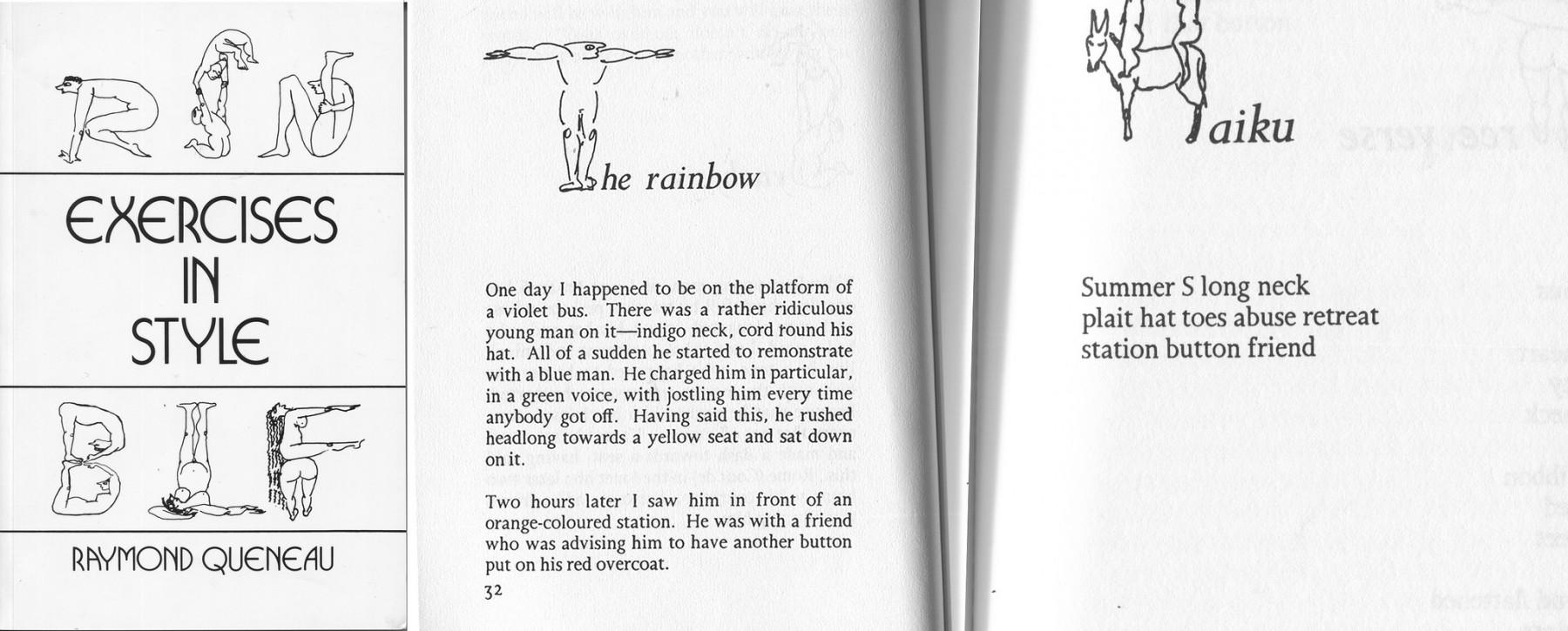
Reading fiction can be a rich way to inform the designer’s creative process. How a writer composes words to evoke ideas, emotion and atmosphere can be compared to how a designer composes typography and image to communicate an idea, and how it can take several forms. One of my favorite examples of this is Raymond Queneau’s Exercises in Style, translated to English in 1958. The writer tells the same story 99 ways using different conventions of language and format. For example, as a haiku, using notation, and in a passive voice.
Process
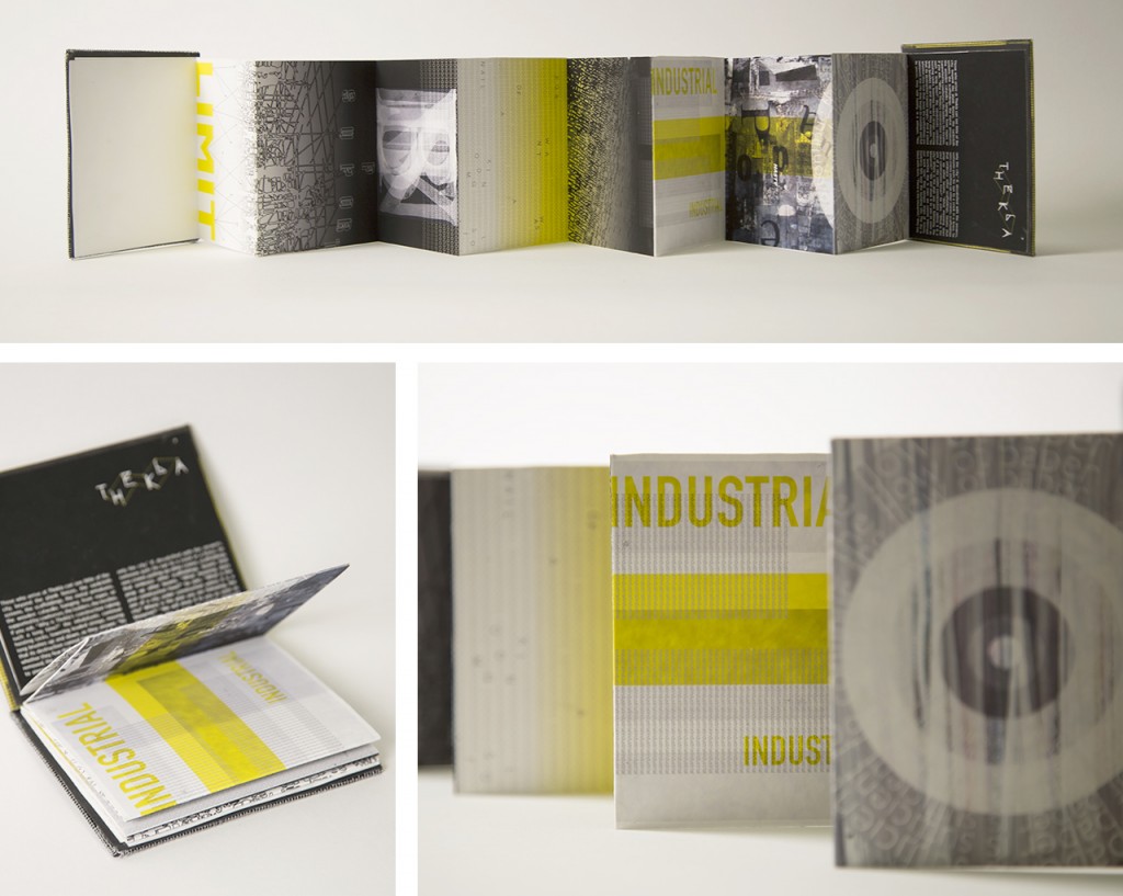
This project is usually split into two distinct parts — process and application. After reading Invisible Cities, students choose a city from the book and assemble a list of adjectives that describe the residents, architecture and activities of the place, and find aphorisms that reflect the themes. I encourage physical, digital and conceptual experimentation, requiring students to make several compositions for each word and aphorism as well as for the city name. As a starting point, students work with 8x8 inch, black and white panels, and then expand iteratively through color, texture and alternate proportions as they design the text for an experimental book.
Calvino’s complex and layered writing provides an opportunity to re-visit fundamental design questions like: How would the interpretation of the words change if a different typeface was used? How does the size of type change how we read? And, what role does legibility play in communication?
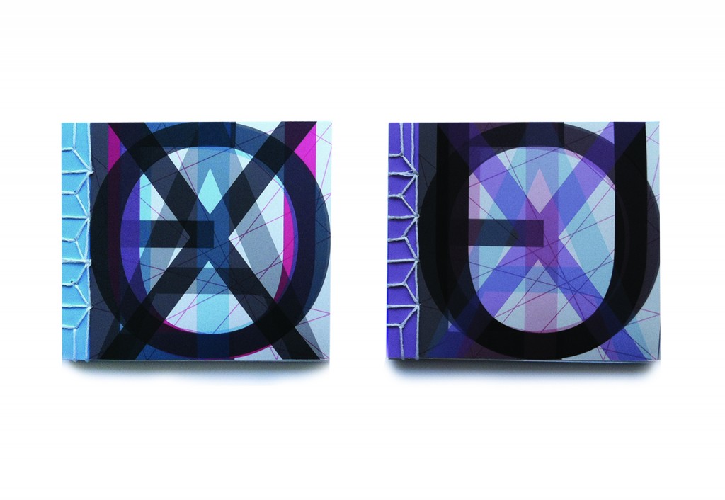
Some of the cities described in Invisible Cities are constructed with unusual materials, reflected in water or the stars, built in the sky and underground, and both connect and alienate their inhabitants. Designing a book with this unique text is an opportunity to experiment with page and book structures that further communicate the unique aspects of each city. While typography can be used to communicate spatial relationships and environments, so can page size, folds, materials and binding methods.
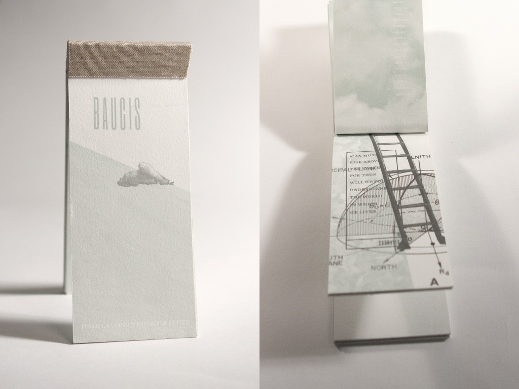
Baucis, a city built on stilts to protect and admire the earth from above. (Mary Galloway)
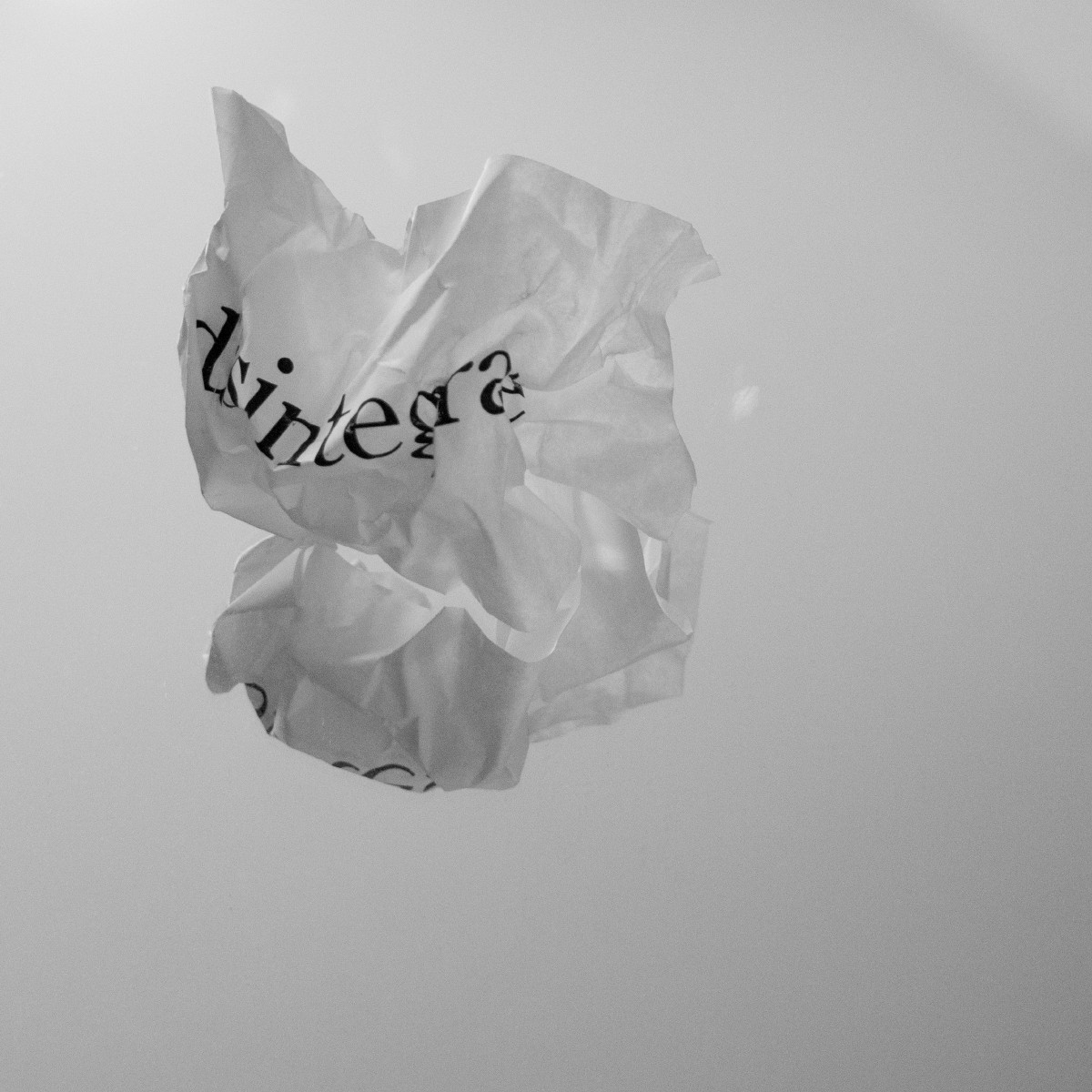
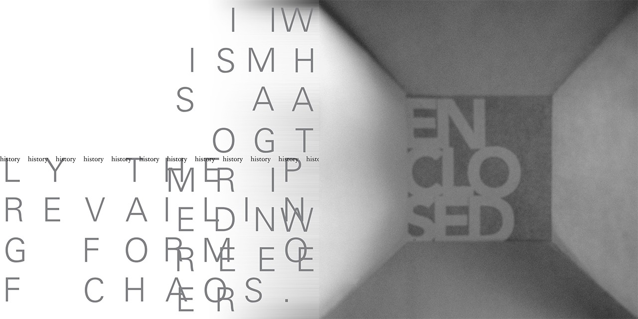
Clarice, a city in which a given number of objects is shifted within a given space. (Sua Kang)
As visual experiments are assembled and edited into a book, composition and cropping are important. I encourage students to imagine a reader “walking” through the book as a person would walk though the city. How does the journey begin? Is it continuous or interrupted? What distractions or navigation aids are there along the way?
Application
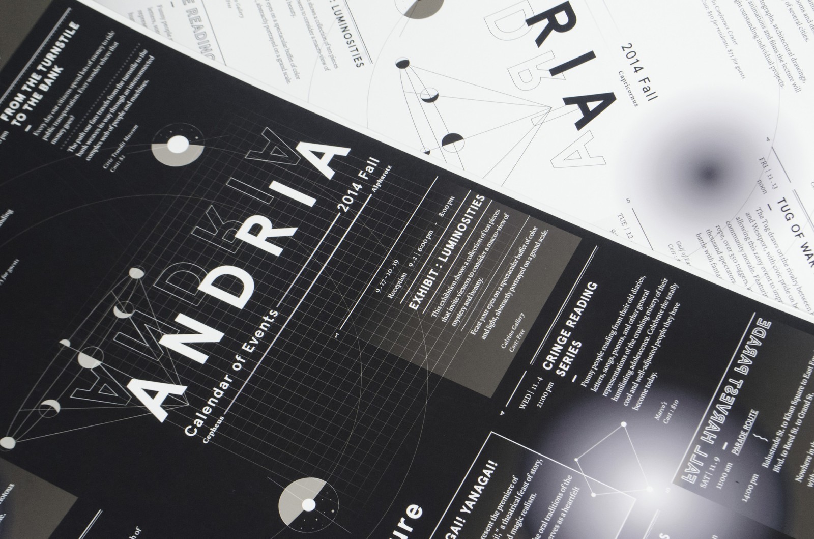
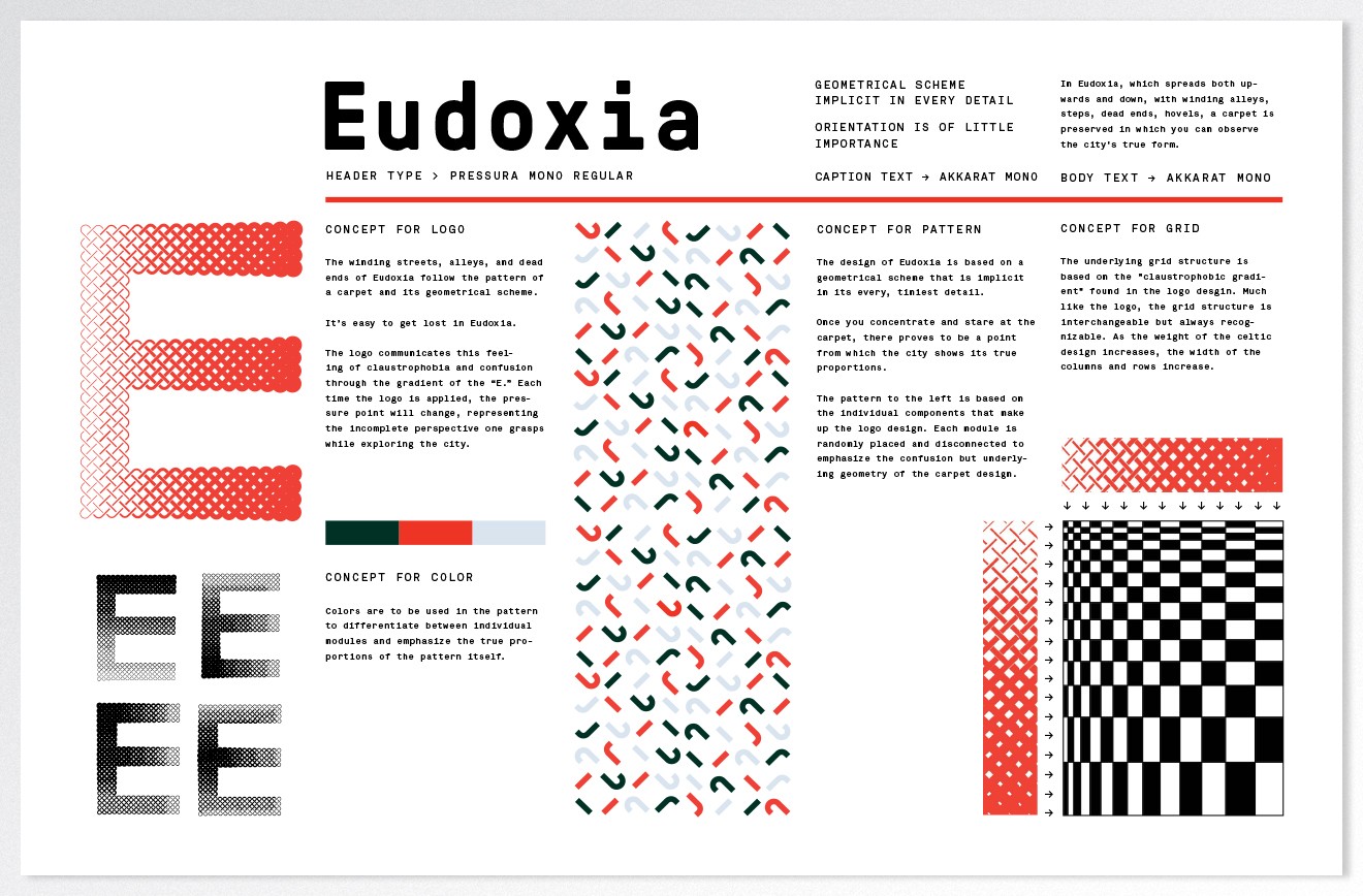
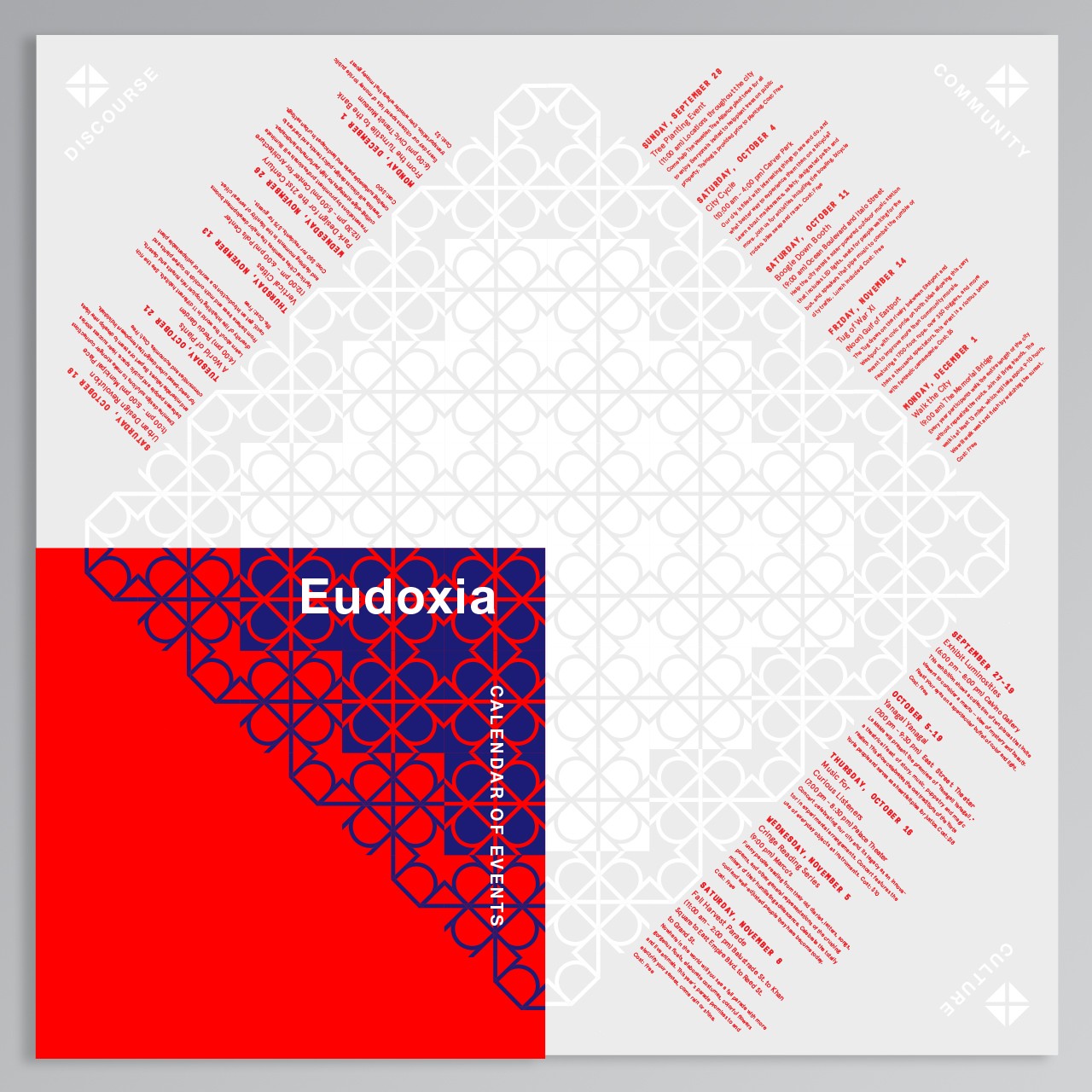
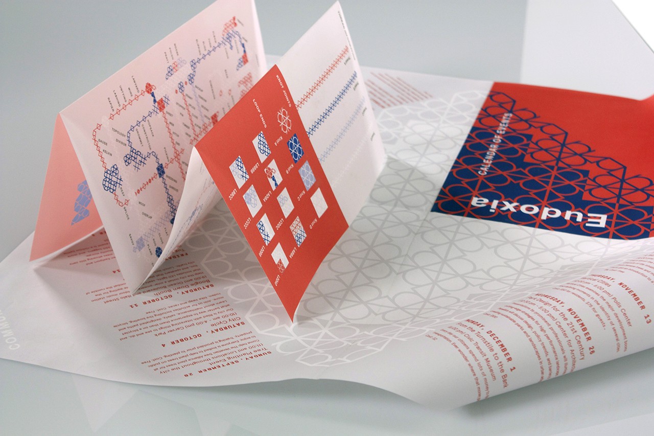
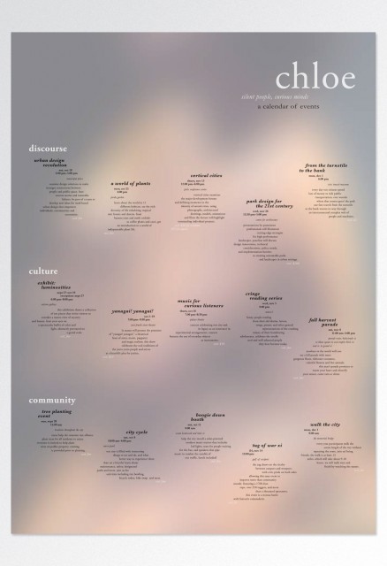
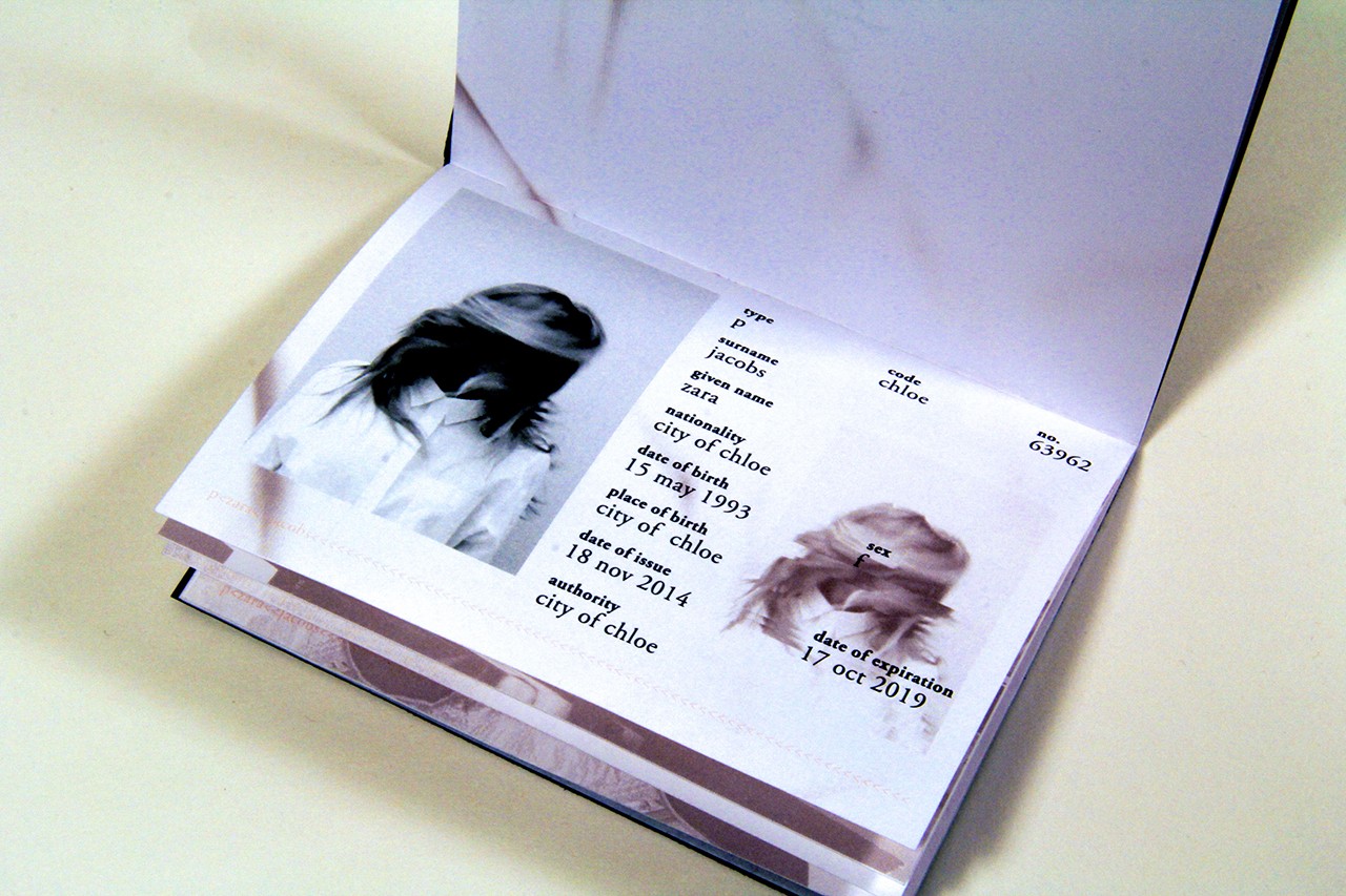
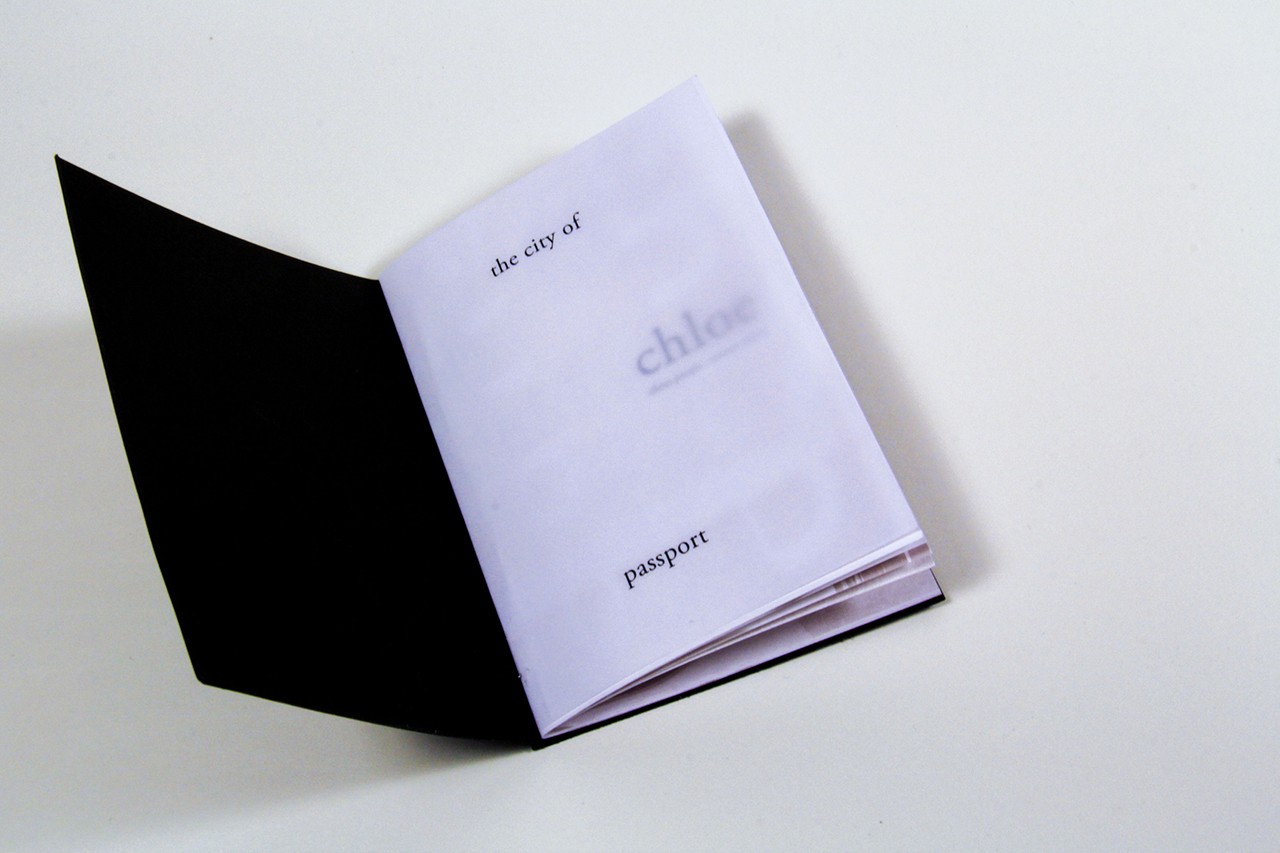
With a deep understanding of Calvino’s text and the unique attributes of their city, students are asked to create a dynamic identity system for the city and then apply it to a variety of items including a calendar of events, digital postcard, currency, transportation pass and map. Students again work iteratively, reviewing the experiments, compositions and typographic forms that they developed in part one of the project. Significant shapes are isolated, repeated and used as patterns or in animations that help tell the story. The goal is to develop a visual language that, like letters, can be combined and that interact like an alphabet for the city. The question becomes, What indexes reference themes of the city beyond the obvious?
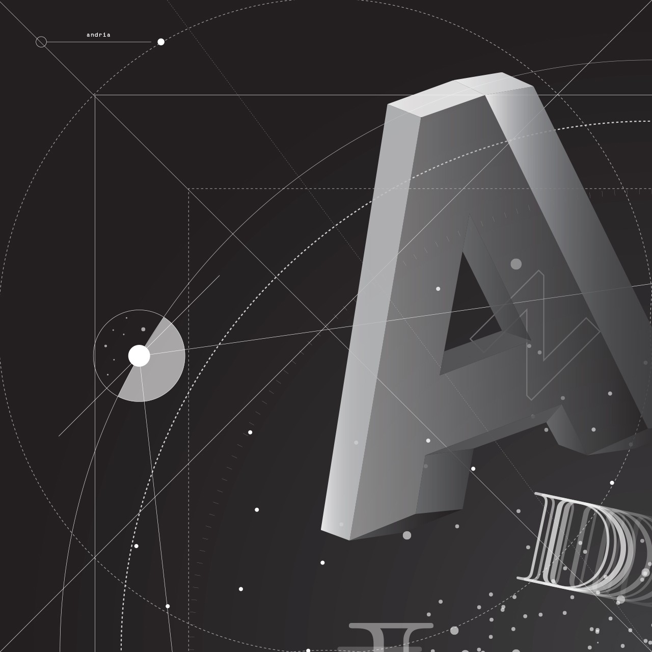
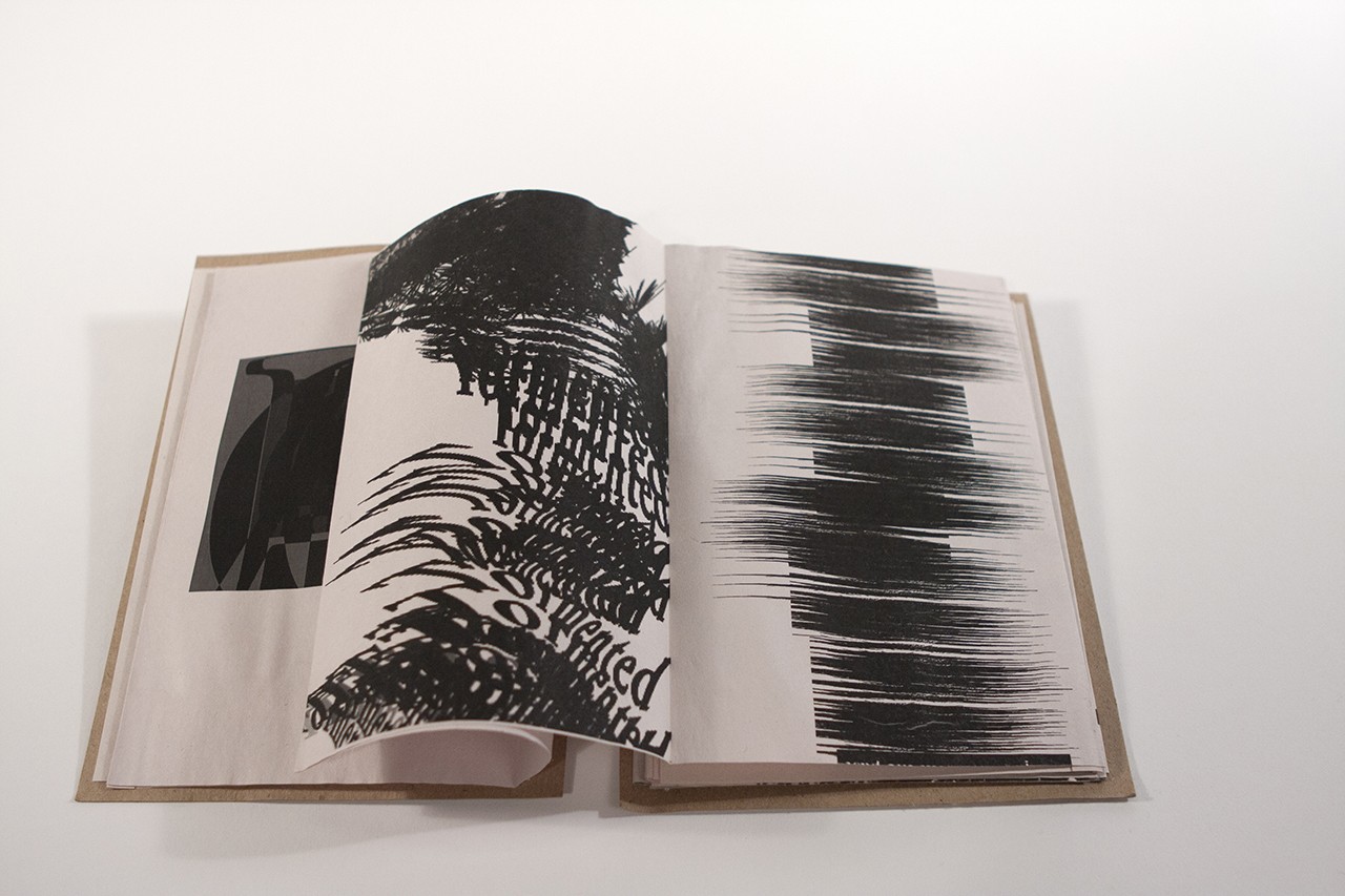
Andria, a city where every street follows a planet’s orbit and the buildings repeat the order of the constellations. (Fumi Omori)
A strong conceptual link between the ideas embodied in the city Calvino writes about and the design of the materials is encouraged. Choices of typeface, alignments, composition, color and material are considered for their visual impact but also for how they communicate — perhaps in ways that are dysfunctional, strange, hidden, mysterious, adventurous, or unwelcome — depending on the story.
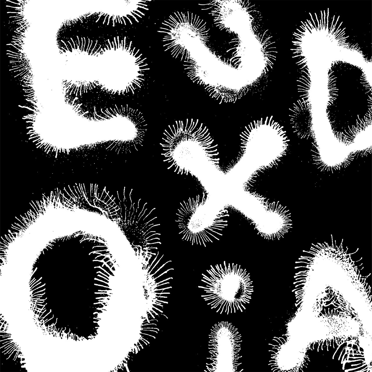
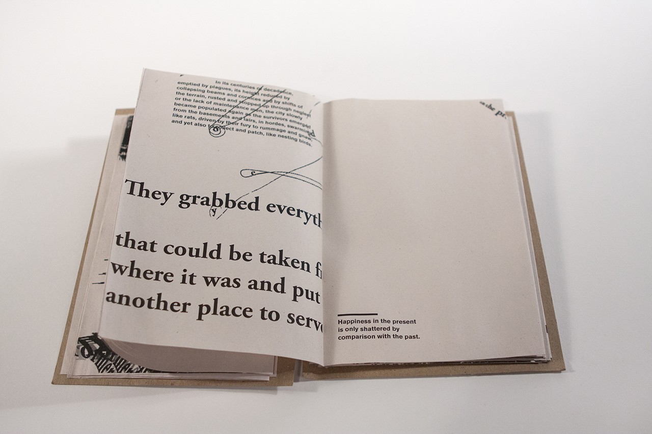
Eudoxia, a city whose true form is mapped in a carpet. (Lily Clark)
Chloe, a city of strangers who imagine encounters yet never speak with each other. (Daniella Ma)

