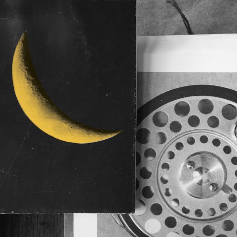
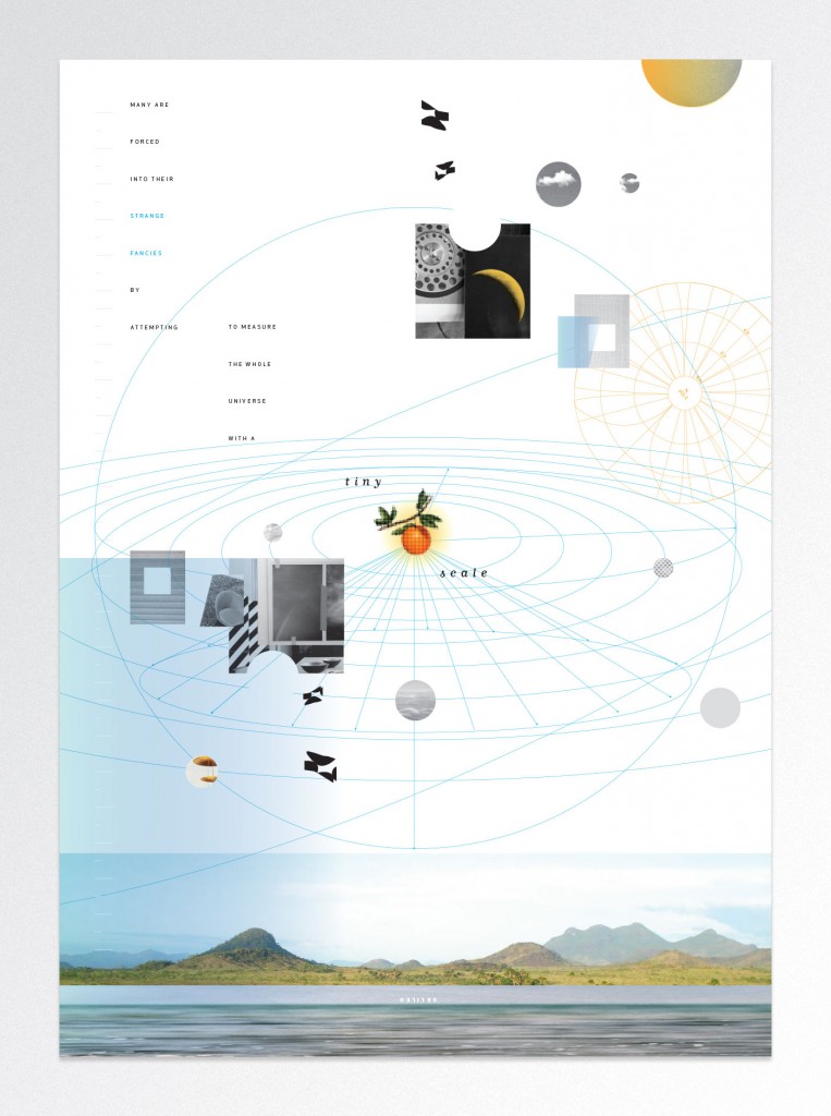
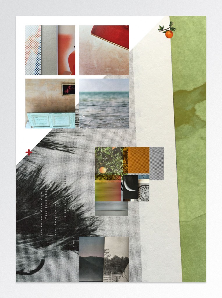
Starting a new project with visual research is a lot like orienteering, an activity that challenges participants to navigate an unknown (and sometimes wild) area with a map and a compass. Orienteers find control points, or landmarks, as they go through the course, documenting the journey at various stations. As a way to get to know a new subject, I search for seminal images, textures or typefaces, then stack or layer them into compositions and finally crop them with the camera to create a map. Why maps? Maps suggest explanations.
Through the map, “we link all [our] elaborately constructed knowledge up with our living.”
- Denis Wood as quoted in Maps of the Imagination by Peter Turchi
If you think about it, maps and the language of place are good metaphors for the creative process. We often talk about the “direction” a design is going or describe a failure as being “lost”. Additionally, maps consider context — they are usually specific to a geographical area, to a certain audience or activity, and have a point of view. These are many of the same things we consider when we begin a design project — what is the specific content, who is the audience, under what condition will the work be used or read, should the tone be humorous, expressive, complex, as simple as possible?
It isn’t a map that creates a phenomena, the map reveals it
Bound by a frame, the map presents an area to explore and tells the story of a place by what it includes (and by what it doesn’t). Symbols, colors, typefaces, and scale can suggest relationships, possible routes and the potential of place.
“Many are forced into their strange fancies by attempting to measure the whole universe with a tiny scale.” — Galileo


