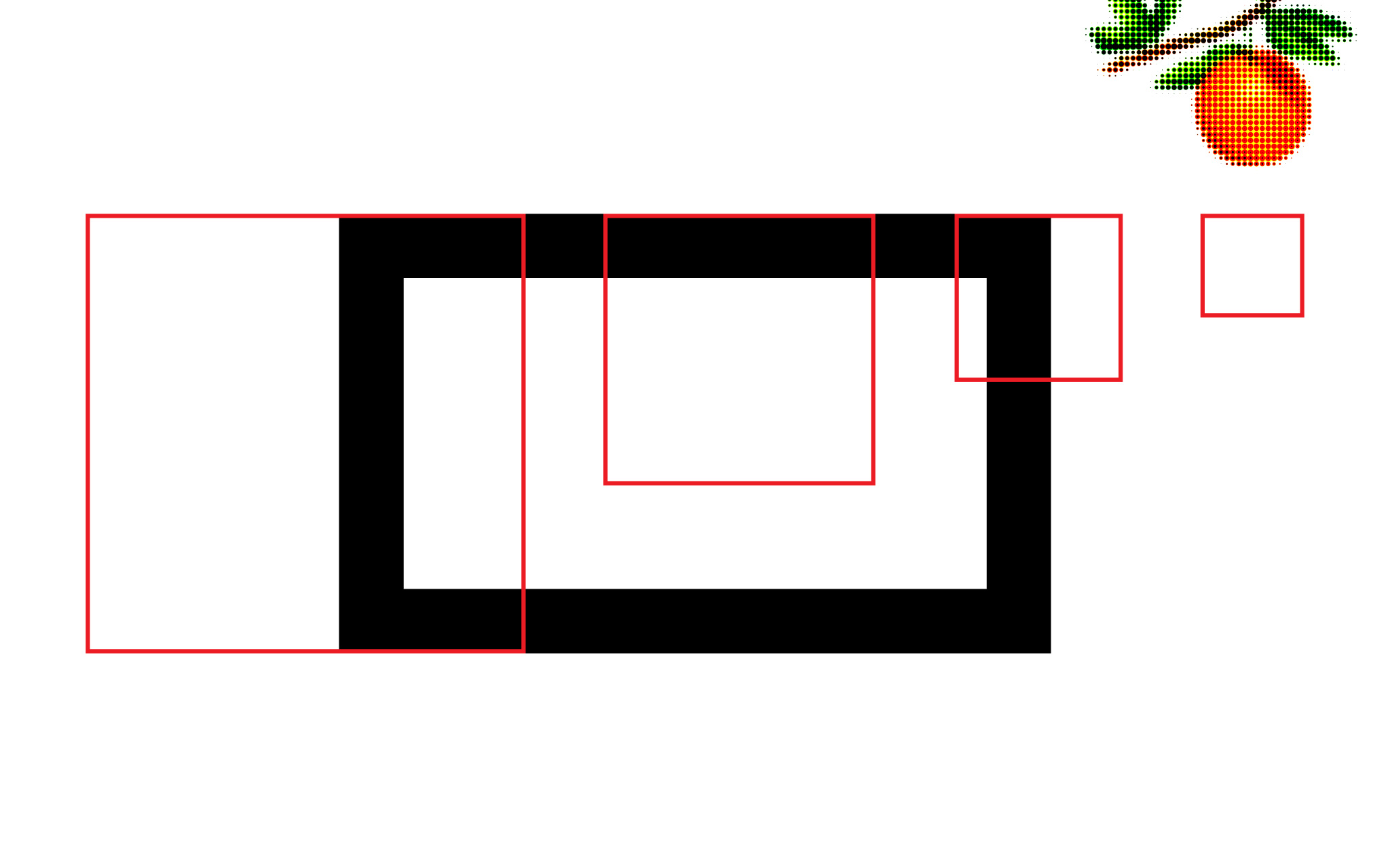
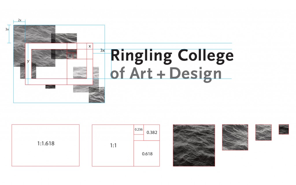
Ringling College of Art and Design’s dynamic identity combines a fixed frame and typemark with a collage of images that communicate the diversity of students, programs and activities at the college. Originally designed by SamataMason, the identity system includes a frame based on the golden rectangle that overlays a series of four sizes of squares (also based on the golden rectangle). The squares can be filled with images, patterns, textures and shapes, and are composed according to a set of proportional rules.
The Ringling identity provides the opportunity for variable content within a firm system, resulting in ultimate variety and reliable consistency. Q Collective was asked to create three new identity compositions—two that are color and one that is black-and-white. The challenge was to compose visually engaging and symbolic images, according to the proportional rules outlined by the identity guidelines, that could be used for a variety of applications—on screen, in print, at large and small scale.
Image, Texture, Shape & Symbol
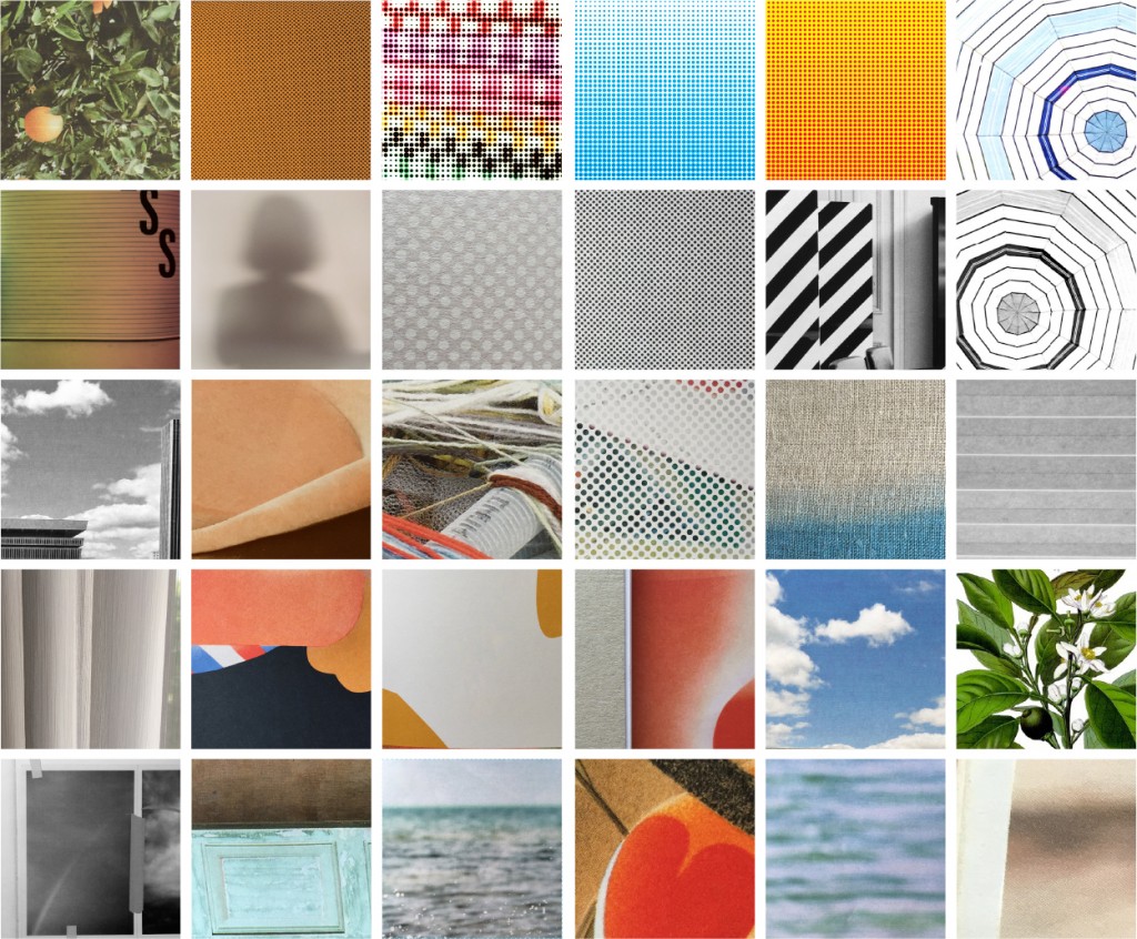
Our image search was both deliberate and intuitive, guided by exploration of place (Sarasota, Florida) and activity (making). Working with word lists, online archives, photographs, sketches and drawings we built a catalog of images to use as a starting point for the identity compositions.
We found/created images, textures and colors that conveyed location, process, media, tools, expression, experimentation, interaction and growth. The images were cropped to squares to evaluate their potential to make a dynamic, energetic compositions. The process of cropping allowed us to investigate the communicative potential of scale, positive and negative space, edges, contours and repeated elements. While images tended to be abstract, icons and shapes were explored that represent the architecture, tools and materials found at Ringling. Simple, abstract shapes created clarity of form and symbolized two, three and four dimensions.
Compositions using only letters were also created, but we found that their visual detail and active forms either competed with or were lost in combination with the overlayed frame.
Experimentation
The fixed frame of the identity system could easily merge with the variable composition, instead of laying on top. With much experimentation we found the best results working with images that had depth of field, using repeating elements so the eye could recognize patterns, and aligning the squares with a micro grid to create an orderly randomness. Compositions with too many elements looked fragmented (and wouldn’t work at small sizes) and compositions that were too uniform looked static (especially in black and white).
Experimentation and testing led to the final three options that the college is now using as part of their overall identity. These allow for variety of application and size while expressing the unique culture and experiences that define Ringling College of Art and Design.
