Background
Maps construct—not reproduce—the world.
This is the title of the first chapter of Denis Wood’s The Power of Maps. I always find this idea helpful when thinking about typographic grids (and other facets of type, too). They are constructed to emphasize what a designer hopes to communicate. And like maps, no one scale or grid fits every situation.
Embodied in mapping is layering, path, symbol systems, and composition. Typography shares these visual and communicative aspects.
My interest in mapping is not as information design, but as an exploration of journey and of place. A good map conveys a scale of time, too.
Embracing complexity, maps allow users to discover their position and chart their movement. They also are not limited to a prescribed, single journey. Great typography and design does the same.


Process
Over 4 projects, the class investigates how maps structure, represent and interpret information. Students also explore how they can translate mapping into a creative problem-solving methodology.
For all of these projects students are limited to tabloid (11x17 inches) as a final size, only typefaces from the Univers family, and the color black.
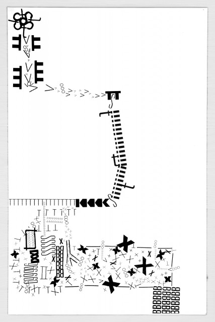
The first project in the series asks students to explore how they navigate to class. They thoroughly investigate and document, in writing, the visual clues and landmarks encountered while on their journey. Next, students symbolically represent their travels via a familiar and existing set of signs; the alphabet. Students are asked to consider weight, size, case and choice of letterforms. Through analysis and critical decisions informed by how symbols function and interact, they produce a map that visually instructs their experience.
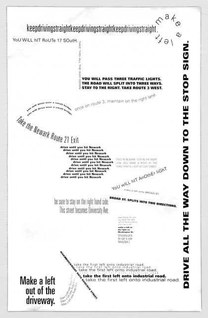
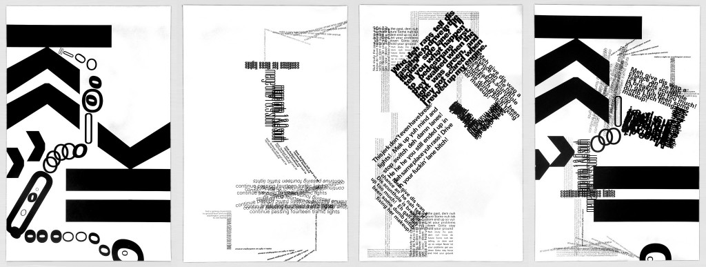
In project #2, students explore how a list functions as a map—a symbolic set of instructions. To do this, they chronicle their journey to class and translate it into a visual representation of their path. Using a sentence (a discrete line of type) as the basic unit, students explore how variations in line length, repetition, direction, and flow clarify the steps involved in completing a task.
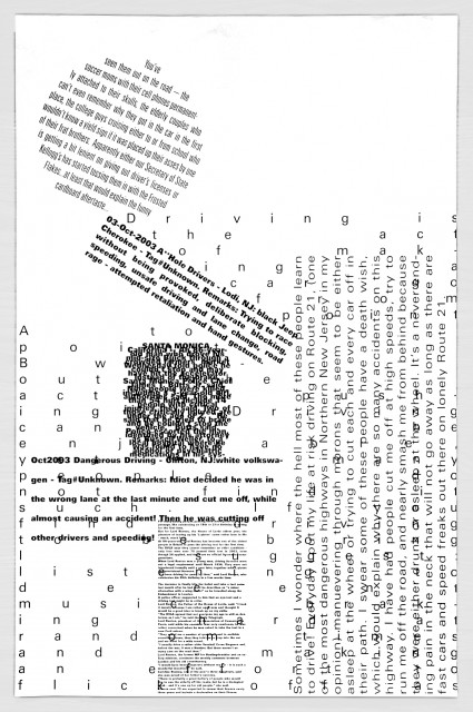
Up to this point, students are provided with specific content. In project #3, they are limited to two types of signifiers—typographic columns and blocks—to map a particular aspect of their journey to class, like what they hear, see or think about. Formally, students consider orientation, shape and layering of text block. With this assignment they work to establish a good fit between the symbols they are given and the specific information they choose to represent.
Mapping can clarify and communicate individual aspects of a journey or experience. But unlike the maps produced for the projects to this point, few people experience a journey discreetly through the specific details of wayfinding, narration, or description. Just as observation is cumulative and multi-faceted, so are maps.
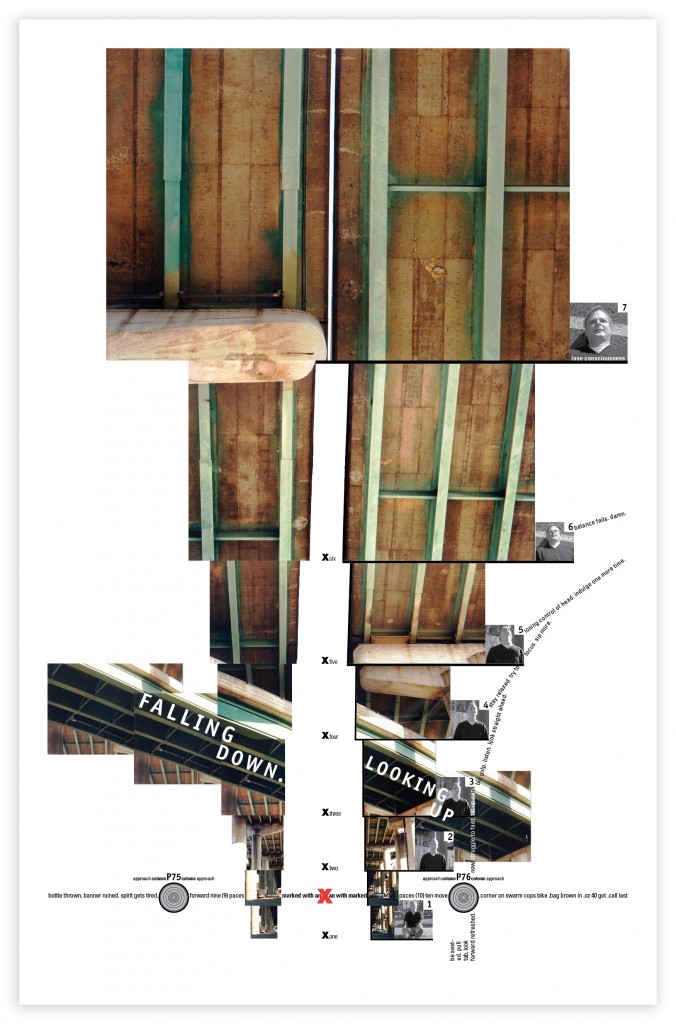
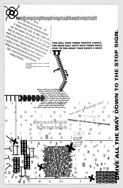
The final project in the series allows students to provide a more natural interpretation of their journey to class. By combining the distinct symbolic language and content of the three previous maps they’ve created, students provide a potential traveller with a visual set of instructions that is at once structured, parallel, contrasting, overlapping, and hierarchical.
This assignment is intended for advanced typography students, but could be easily adapted for beginners. It runs for 5 to 7 weeks, depending on how many times the class meets each week.
