History
In 2014, we inherited the book for the 6th edition from faculty/mentors at Virginia Commonwealth University where we attended graduate school. Originally published in 1985, it was and remains one of the only comprehensive typography textbooks for students, teachers, and practitioners. As designers and educators we were excited to guide the book in a different direction and added a lot of new content. We also revised the design of the book, with a new grid and typographic style sheet. We wrote about the challenges and opportunities of designing a new cover for the 6th edition, aiming to honor the legacy of the book while acknowledging our role as new authors.
Typographic fundamentals are universal
Typographic Design was originally written before digital typography. As new advances in technology came about, computer systems required different processes and technical constraints than traditional typesetting. New chapters were written to help designers work with digital typography. In the last 5 years, advances in typeface distribution, web site/app layout, and typeface design have closed the distance between analog and digital design outcomes. As such, we decided to reorganize the 7th edition around core typographic design fundamentals, while providing ‘tweaks’ that are medium specific.
Typographic process is evolving
When we started planning the 7th edition, we wanted to focus on how design/typographic process has evolved. Rapid edits and deployment, collaboration between authors and designers, content gathering, and methods of utilizing and generating typographic form are all part of how typographers now work. The timeline, case studies and typographic technology chapters were great places to illustrate and expand on what has changed since the 6th edition. We also wanted to demonstrate the interconnectedness between print and digital applications and media used by designers.
Timeline
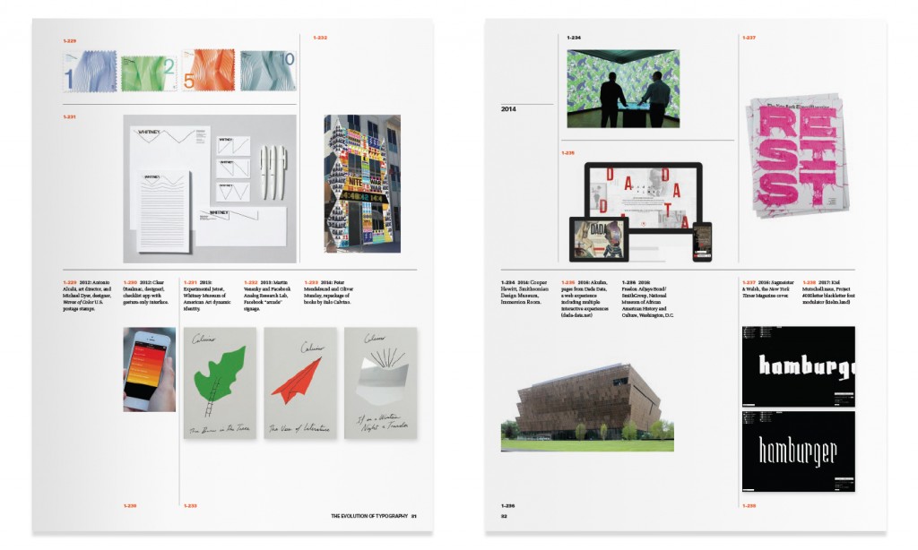
At the beginning of each new edition, we discuss what we think is influential now and what will be important in the future. Projects illustrating those ideas are incorporated into Chapter 1, the timeline of the Evolution of Typography. We looked at a diverse range of media, forms and processes, and it is this framework that was used as a lens for the rest of the book.
We look for examples of significant moments in recent design history, not just exclusive to typography. For the 7th edition, we added book covers by Peter Mendelsund and Oliver Munday (2014), the immersion room at The Cooper Hewitt Smithsonian Design Museum (2014), Dada Data, an online collection and interactive experience about art by Akufen (2016), a political New York Times Magazine cover by Sagmeister & Walsh created with material typography (2016), the Museum of African American History & Culture designed by David Adjaye that explores race, form, and symbol (2016), and Mercurial Black, a font modulator by Kiel Mutschelknaus (2017).
Motion, iteration and interactivity
Case Studies
Chapter 9 includes three new case studies featuring projects that show how designers work with type is evolving. For example, Dutch firm Studio Dumbar, details how they use motion experiments in early stages of a project to test ideas and explore iterative typographic form. The case study shows two identity projects using motion, including one for Alzheimer Nederland which illustrates how the initial video sketch established a meaningful typography concept that fades, similar to memory, on brochures and posters.
In another case study, Chicago-based firm Thirst shares their iterative, methodical process for designing a new identity for Exhibit Columbus. Starting with six different graphic directions, they reinterpreted the original typemark (by Paul Rand) and color palette (by Alexander Girard). Iterations of different geometric modules provided patterns and identity components for everything from signage to print materials, a website and buttons. This project also demonstrates the diverse applications typographic systems now inhabit.
The third new case study highlights screen-based, interactive graphics created by Bloomberg Graphics. At Bloomberg designers engage in a highly collaborative process with journalists, developers and data analysts. They work together to make the vast amounts of text in their articles and info graphics useful and legible, all while telling a good story (both in print and on screen) using photography, typography and interactive cues. The case study describes the process and challenges of information design for three articles: Who Marries Whom, Takata Recall and Betting the Farm.
Generative typography
Typographic Technology
Changes in typographic design and process have been directly linked to the evolution of technology. Chapter 7, which describes the history of typographic technology, was updated to include generative typography (also known as parametric typography). This new method of designing typefaces relies on creating rules for a letterform as opposed to drawing a fixed glyph. The rules may be formal or respond to sets of data, like weather or location for example. Generative typography allows designers to create their own tools, and to iterate wildly.
The book introduces readers to projects like the metaflop modulator web application which demonstrates a parametric variable typeface. Metaflop modulator allows users to alter typographic parameters in real time instead of selecting preset weights, widths, or orientations (Designer: Marco Müller). And to the typeface, Laika, which dynamically adjusts typographic details based on a variety of user inputs and data including weather conditions. There is also discussion of tools like Processing and how they can be used to analyze typographic structure as in the example of the letter R (Designer: Devin Halladay).
And much more!
This book is a labor of love for us and we are thrilled to see it out in the world, connecting and inspiring students and practitioners. The 7th edition builds on a great foundation of work by Rob Carter, Ben Day and Phil Meggs, and we have learned a lot from their passion for typographic form, syntax, communication and expression. We are also grateful to our colleagues in design education and students at MICA who constantly share theories and problem solving approaches to using typography.
The 7th Edition of Typographic Design: Form and Communication is published by Wiley.
A version of this article was presented at Type Family, an event curated by Ellen Lupton, at MICA in February 2018. See the video here — our 10 minute talk starts at around 34:00.


